• Work
  • About
  • Reel
  • Media
  • Blog
  • Studio

CAROLINE A. LE

Animation + Motion Design Portfolio

  • Work
  • About
  • Reel
  • Media
  • Blog
  • Studio

Main Title Design: A Controlled Experiment

Homework assignment #3 was awesome. Hands down my favorite so far, but that favoritism progresses with each class. This week's assignment was exactly what the title of this post suggests. While learning about a few design techniques within photoshop and illustrator, along with some workflow best practices, the two biggest takeaways were the importance of communicating the narrative and how to be resourceful. Sometimes as designers all we get to work with are a few images and the tools that live within our favorite Adobe products. If you've built an asset library over time you're in good shape, but those less diligent who are also faced with the less than ideal situation of a client giving you bare bones to work with can present quite a challenge. That's where this class became super helpful.

When working with limitations, workflow becomes even more important. We were introduced to asset management and narrative build-out within Adobe Bridge, which up until this class, I have never touched. In fact, whenever I've accidentally clicked on the application in the past I've never known it's purpose so learning how it can apply to early concept development was super beneficial. Before we jumped into Bridge though we were tasked with creating a mind map. I've used mind maps in the past for projects where I've had a decent amount of time to dedicate to preproduction, but it was a great reminder to hear Ash talk about how important this step is no matter how much time you get in the beginning of any project.

“A documentary exploring the politics, science and heroism of the Apollo missions”
— HW #3 Client Brief

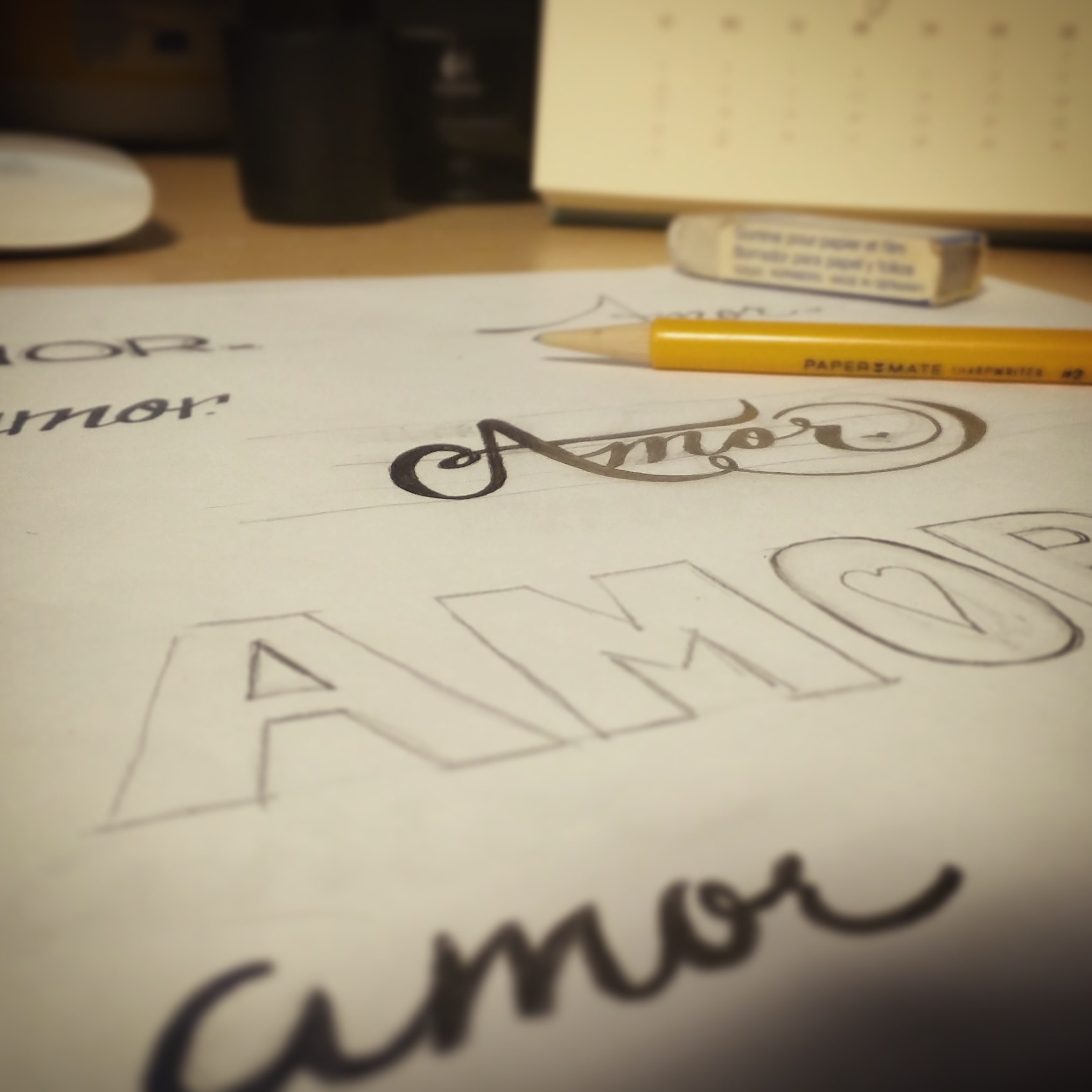
After reading the client brief (premise) above we were advised to jump right into our mind maps. Below is the one I put together. It was interesting to see how individual artists could really spin the brief in all sorts of directions given their personal breakdown. The heroism portion of the brief was what piqued my interest the most, and as a result, keywords around heroism really played out in my final designs.

mind mappin'

Following our mind maps, we were given a set of forty NASA images and whatever could be generated from scratch within photoshop and illustrator to craft six original styleframes for the hypothetical film One Small Step. That's it. No additional assets from your personal arsenal. No fancy plug-in's. No nothing -well, that's how it came off to me. And honestly, it was a particularly rewarding challenge. Of course, the stunning images that we were given to work with made the art of composition happen naturally, too.

HW3_FRAME1.jpg
HW3_FRAME2.jpg
HW3_FRAME3.jpg
HW3_FRAME4.jpg
HW3_FRAME5.jpg
HW3_FRAME6.jpg

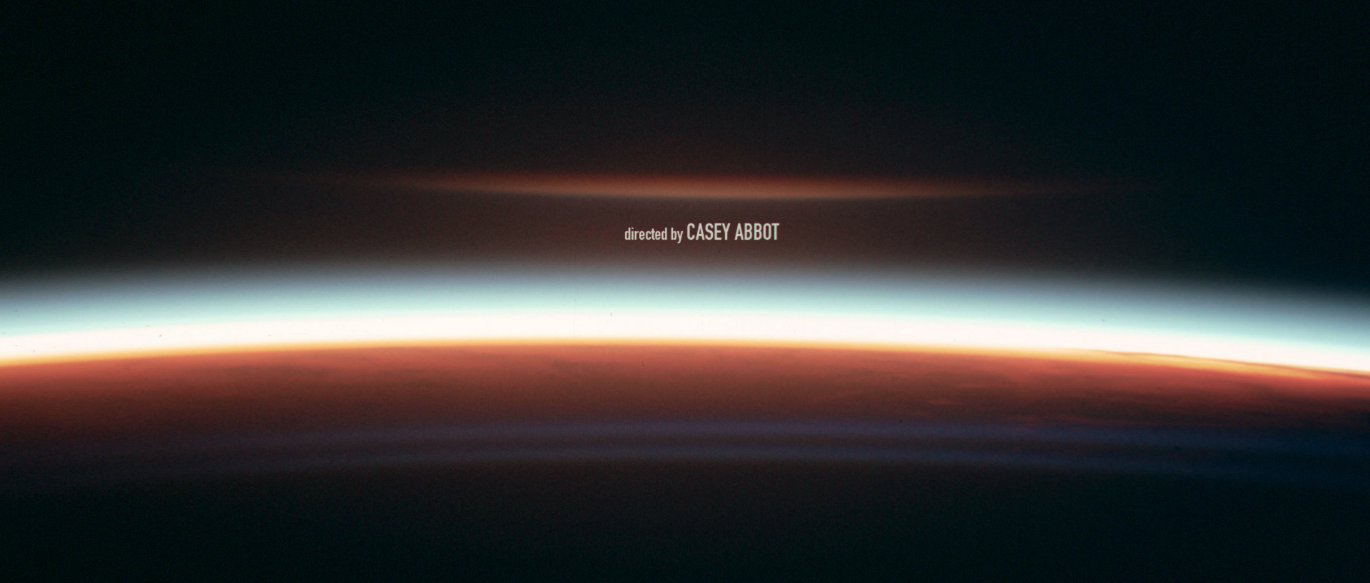
I was impressed with what I was able to achieve with only a few images and a few tools. I was forced to look beyond each of the photos as simply photos, but also as assets like textures, lights, frames, etc. As previously mentioned, I decided to focus on the heroism aspect of the brief more than anything else, and I felt the imagery supported the theme well. In the end, I felt that my compositing made that theme evident. One setback I noticed while building these styleframes though was that I developed a tunnel vision towards the heroism theme without acknowledging some of the other themes I wrote down, and I hope that this is something that will change so that my narratives are more well rounded as I continue to go through the course. So while the other themes of politics and science aren't incorporated much into these styleframes I think the general idea of the Apollo missions is there, but I'll let you be the judge of that ;)

PS -Ash, if you ever decide to drop the whole film thing you'd be great a great professor! 

Saturday 12.30.17
Posted by Caroline Le
Comments: 2
 

Main Title Design: Typography

Time to hand in assignment number two! This assignment was a lot of fun because, to be completely honest, type is the last thing I think about when it comes to concept development, and it really shouldn't be because type can act as the glue that holds everything together. Some might argue that sound design acts in the same way, and I totally agree. In fact, the material from this class made it very clear that paying attention to the little details as much as the bigger picture is just as important when building your final composition. I have a whole new way of looking at type in the overall scope of a project now.

It was during this class that we were introduced to our final assignment, and how developing the look and feel of the type so early on in the production process could drive our design decisions later on. We learned about the important role type plays not just in design, but in society as well, and the evolution of type over the years. We also learned how to deconstruct and reconstruct type by learning the different vocabulary associated with it, and how the elements of a typeface, as well as it's family, can drastically affect an overall design. For instance, learning about the early printers who developed some of the most common typefaces of today and their decisions for balancing elements like line weight was incredibly interesting. There is a reason why certain typefaces are more appealing than others, and why creating a typeface from scratch is a hard craft to conquer. We may not realize it, but these characteristics play a big role in balancing our designs.

Below are some typefaces I messed around with, and the one I ultimately ended up choosing to use for my final assignment. I think the weight of Verlag made it a versatile choice given that it has both sharp and rounded edges, which I felt was similar to the design of a playing card. It also had a few different weights to play with, which made it even more of a versatile choice. As I continue to progress through this course there will inevitably be an evolution to my font choice, and while the visuals from this week's assignment may not be the most captivating, it is important for overall development. Check out the font placement frames below, and stay tuned for more progress made in Main title Design.

HW2_Font Exploration.jpg
HW2_FRAME1.jpg
HW2_FRAME2.jpg
HW2_FRAME3.jpg
HW2_FRAME4.jpg
HW2_FRAME5.jpg
HW2_FRAME6.jpg
Wednesday 12.20.17
Posted by Caroline Le
 

Main Title Design: Analyzing Titles

A few months ago I decided to enroll in a course led by one of my favorite industry professionals, Ash Thorp, and the journey so far has been very rewarding. I admire Ash's work a lot, and he is a big influence on my art. I thought about taking his course Main Title Design for the longest time, and when I finally had some time to dedicate to it, I jumped right in. I may be fascinated by his work, but my main reason for enrolling was because I wanted to gain a new perspective on how to approach my work while honing my skills, style and originality as a designer. And while I have my own way of doing things I felt I needed to challenge how I approached concept development and the idea of creating altogether in order to manage my versatility and continue to be relevant.

Main Title Design is a course dedicated to crafting detailed and enticing title sequences, and if you know me you know that I am a title sequence junkie. When it comes to watching TV or a movie the opening credits of a show are sometimes more interesting to me than the show or movie itself. It's like watching a mini movie within a movie, and if done correctly, it tells the whole story in a matter of minutes. And even though streaming services now give us the option to skip past these sequences (thoughts on this for another time), when we talk about our favorite shows and movies, present or past, we cannot talk about them without talking about a stand alone introduction.

Take The Sopranos for instance, not because I am a New Jerseyan or the fact that I'm binging on it for the third time, but because everyone who watched that show in the 90's and early 00's remembers that low-toned 'Woke Up This Morning' song and the images of Tony Soprano riding along the New Jersey Turnpike. The imagery and the song lyrics told the story all in the first minute and a half of the show. I didn't watch the show in it's entirety for the first time until a couple of years ago, but I had a general idea of what was going to happen based on what the title sequence hinted -the man of the household, who we eventually learn is Tony Soprano, is involved in some ominous business (possibly the mob) that operates in northern New Jersey. Everything including the discrete camera angles, the not-so-revealing characterization of Tony, and the typeface of the show title came together effortlessly into a little montage of who and what was going to happen in the bigger picture. And the music, it was what tied everything together. (Side note: if you're interested in a formal breakdown of The Sopranos title sequence head over to The Art of the Title and read this awesome interview.)

Gabagool and mutz aside, the more I got involved in my career in television, the more I took an interest into title design in particular, which ultimately led me to Ash and his beautiful work. He has been an inspiration ever since, and I have already learned a lot from him in the short amount of time that I have become a Learnsquared student. As a student of the Main Title Design class, I've been tasked with several homework assignments, the first one involving analyzing some of my favorite title sequences of all time. The Sopranos was not one of the chosen ones because I ended up focusing on some more graphic design focused pieces. Feel free to take a look at my analyses of the ones below, and stay tuned for more to come from my journey as a student in Main Title Design.

HW1_The Eighties-Title.jpg
HW1_The Eighties-Font.jpg
HW1_The Eighties-Frames.jpg
HW1_The Avengers-Title.jpg
HW1_The Avengers-Font.jpg
HW1_The Avengers-Frames.jpg
HW1_Narcos-Title.jpg
HW1_Narcos-Font.jpg
HW1_Narcos-Frames.jpg
Friday 12.08.17
Posted by Caroline Le
 

Charleston & Savannah Getaway

I recently took a trip down to the low country and it was simply the best. The amount of days we spent in Charleston and Savannah plus the travel time was absolutely perfect, and made for a great vacation. If you've never been to either I'd highly recommend going. Both cities are in a beautiful area of the country with great food, nice people and lots to explore.

I knew I had to bring my camera with me for the trip and I'm so happy I did because, despite having a few rainy and overcast days, the architecture in both cities was stunning. Most people think of antebellum architecture when they think of the south, but Charleston and Savannah had styles that ranged from before the Civil War all the way to modern day. I'm particularly drawn to colonial and victorian architecture, so most of my photos from the trip reflect that style and time era, but there was way more beyond what these photos depict.

I could go on and on about the walking tours, the food we ate and the sites we saw, but I'll leave that for another lifstyle-blogging-esque time. However, if you're thinking of booking a trip down south and would like some recommendations feel free to hit me up! Otherwise, enjoy a few snapshots from our time down there and make sure to follow @formerlealbrecht on instagram for more photography, design, animation and video work :)

View fullsize CS-5.jpg
View fullsize CS-8.jpg
View fullsize CS-9.jpg
View fullsize CS-13.jpg
View fullsize CS-14.jpg
View fullsize CS-20.jpg
View fullsize CS-23.jpg
View fullsize CS-25.jpg
View fullsize CS-30.jpg
View fullsize CS-35.jpg
View fullsize CS-40.jpg
View fullsize CS-59.jpg
View fullsize CS-61.jpg
View fullsize CS-67.jpg
View fullsize CS-69.jpg
View fullsize CS-70.jpg
View fullsize CS-72.jpg
View fullsize CS-73.jpg
View fullsize CS-76.jpg
View fullsize CS-80.jpg
View fullsize CS-85.jpg
View fullsize CS-89.jpg
View fullsize CS-96.jpg
View fullsize CS-110.jpg
View fullsize CS-114.jpg
View fullsize CS-131.jpg
View fullsize CS-140.jpg
View fullsize CS-148.jpg
View fullsize CS-153.jpg
View fullsize CS-157.jpg
View fullsize CS-159.jpg
View fullsize CS-163.jpg
View fullsize CS-168.jpg
View fullsize CS-179.jpg
View fullsize CS-182.jpg
View fullsize CS-183.jpg
View fullsize CS-186.jpg
View fullsize CS-187.jpg
tags: charleston, savannah, travel, photography, architecture
Thursday 11.16.17
Posted by Caroline Le
 

Amor: A Passion Project

Sometimes when your mind runs wild with endless ideas you need to get out there and make them happen instead of waiting for the right moment to do so. No ifs, ands or buts about it. And that was just the case for this passion project of mine.

For about a year or two now, I knew I wanted to work on a fun dance themed project with some friends and colleagues outside of work. I have always imagined working on a piece that utilizes different and dramatic frame rates, glowing and natural visual effects, and ornate choreography, but for the longest time my daily routines, commitments and freelance schedule precluded me from pursuing it. That changed this past May when I found out that a friend of mine knew some really amazing dancers that were interested in helping me with the idea. With summertime quickly approaching and the many weekend excursions, barbecues, weddings, vacations, beach trips, and get togethers that come with it, we decided it was the perfect time to tackle the video.

Amor Location
Amor Location

Location scouting still

Amor Handlettering
Amor Handlettering

Logo design progress still

Amor VFX
Amor VFX

Production still

Amor Logo
Amor Logo

Final logo design

So what is the idea behind the dance-themed piece? Amor, as its name suggests, is a short story of all things love. People mistakenly only associate love with people, but the truth is love can define many things including, but not limited to, one's passion for a hobby or art form, an object, a sensation, an act of perseverance or, as part of this particular story, the enchantment of a city. It is an emotion that can define relationships, and it is the kind of love we feel and associate with our family, friends and loved ones. It is an undying and infinite kind of love. It has no shape or color, and it has no boundaries. But it is without a doubt beautiful and everything that is touched by it is cloaked with its profound beauty. This piece tells the story of two people defined by the many facets of love -their love for and commitment to one another, their shared love of dance, and the love of their home, New York City.

While the purpose of this project was to capture the broad definition of love, it was also meant to be a way for the team to practice certain techniques and skills that we rarely have the time to incorporate into our day-to-day work or on our client-based side projects. For me though this project continued to bring out the theme of love because not only am I passionate about what I do for a living, but I really enjoy learning, and this project without a doubt taught my friends and I a lot.

From the initial storyboards all the way through to post-production completion we learned a ton. I personally learned a lot about location scouting, licensing, production pipelines, rentals, schedule coordination, camera and location limitations, and consequential variables such as the weather on overall planning. I studied light and its interactions with surfaces and materials immensely for my visual effects work, and therefore, learned more about a subject I thought I knew fairly well. I learned a great amount about color grading from Jose our editor/colorist. I learned a lot about choreography and different styles of dance from our dancers Alexey and Aki, production and event photography from Stefania, and I hope my teammates learned a lot from me in return, as well. In the end and given our production constraints (i.e., two cameras, two cards, change in weather forecast, foot traffic, environment, etc.), we were very pleased with the overall outcome and what we were able to achieve with the limited tools and resources we had. It was a job well done all around.

While it was a great learning experience for all of us we most importantly had fun. We had a great time collaborating and creating the video together without worrying about an impending deadline, and I couldn't have asked for a better group of people to work with on this project than these guys. And as I say that I would like to say thank you again to everyone who made this project come together seamlessly. I hope you all enjoyed working on this piece just as much as I did. I look forward to working on more projects with you guys, and everyone else who is passionate about telling a story.

Find out more about the team and their talents/expertise at the links below:

Stefania Orru

Jose Duran

Alexey Gavrilov & Aki Kudo

Watch the full video here.

lights/fog/rain/camera/tango 👉 fun morning with @cbalbrecht @josetherover @gavrilovdance

"lights/fog/rain/camera/tango 👉 fun morning with @cbalbrecht @josetherover @gavrilovdance"

👆above photo by @stefferonipizza

tags: dance, vfx, nyc, love, handlettering, color grading, film, choreography, photography
Tuesday 08.04.15
Posted by Caroline Le
 
Newer / Older