A few months ago I decided to enroll in a course led by one of my favorite industry professionals, Ash Thorp, and the journey so far has been very rewarding. I admire Ash's work a lot, and he is a big influence on my art. I thought about taking his course Main Title Design for the longest time, and when I finally had some time to dedicate to it, I jumped right in. I may be fascinated by his work, but my main reason for enrolling was because I wanted to gain a new perspective on how to approach my work while honing my skills, style and originality as a designer. And while I have my own way of doing things I felt I needed to challenge how I approached concept development and the idea of creating altogether in order to manage my versatility and continue to be relevant.
Main Title Design is a course dedicated to crafting detailed and enticing title sequences, and if you know me you know that I am a title sequence junkie. When it comes to watching TV or a movie the opening credits of a show are sometimes more interesting to me than the show or movie itself. It's like watching a mini movie within a movie, and if done correctly, it tells the whole story in a matter of minutes. And even though streaming services now give us the option to skip past these sequences (thoughts on this for another time), when we talk about our favorite shows and movies, present or past, we cannot talk about them without talking about a stand alone introduction.
Take The Sopranos for instance, not because I am a New Jerseyan or the fact that I'm binging on it for the third time, but because everyone who watched that show in the 90's and early 00's remembers that low-toned 'Woke Up This Morning' song and the images of Tony Soprano riding along the New Jersey Turnpike. The imagery and the song lyrics told the story all in the first minute and a half of the show. I didn't watch the show in it's entirety for the first time until a couple of years ago, but I had a general idea of what was going to happen based on what the title sequence hinted -the man of the household, who we eventually learn is Tony Soprano, is involved in some ominous business (possibly the mob) that operates in northern New Jersey. Everything including the discrete camera angles, the not-so-revealing characterization of Tony, and the typeface of the show title came together effortlessly into a little montage of who and what was going to happen in the bigger picture. And the music, it was what tied everything together. (Side note: if you're interested in a formal breakdown of The Sopranos title sequence head over to The Art of the Title and read this awesome interview.)
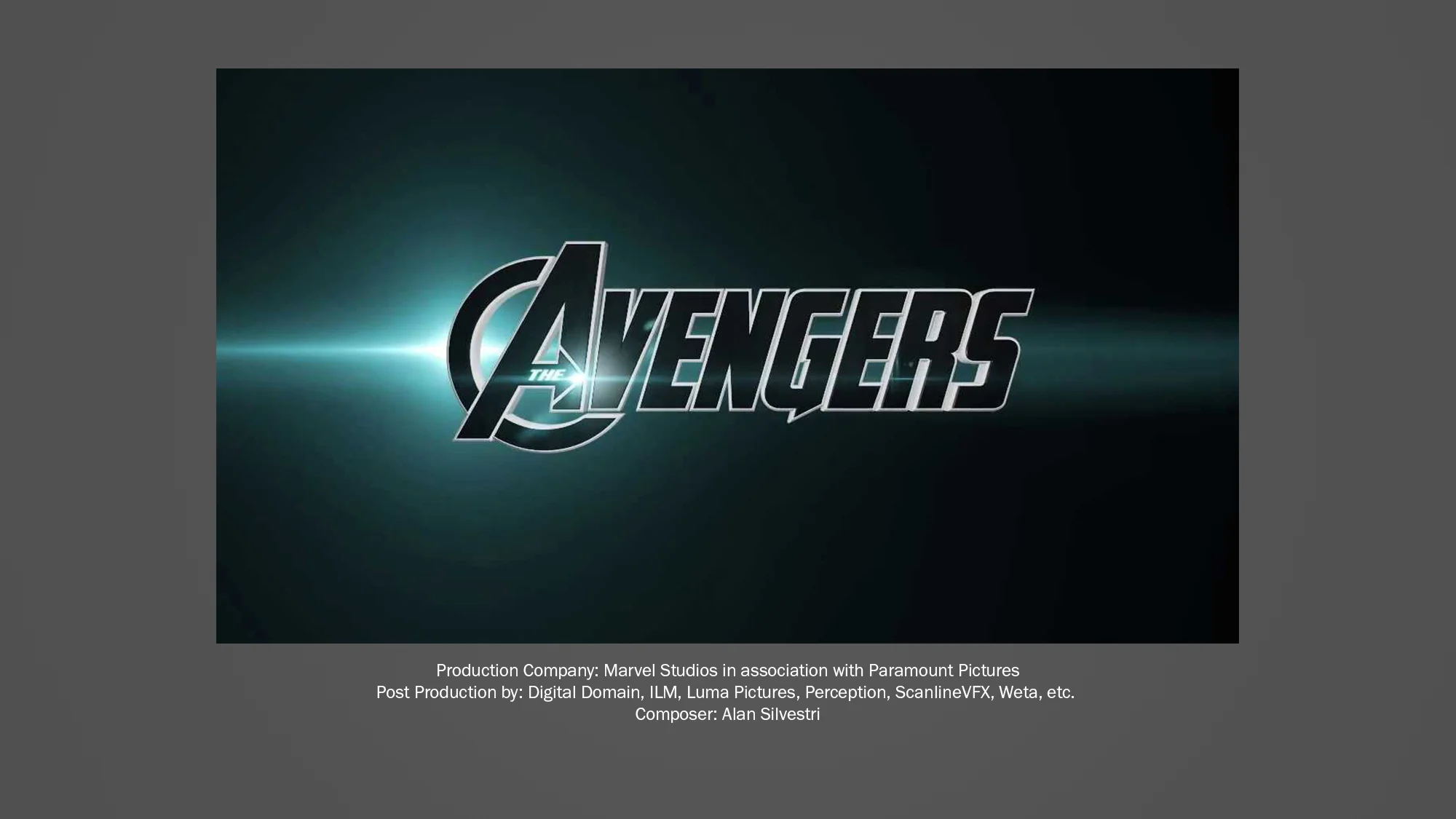
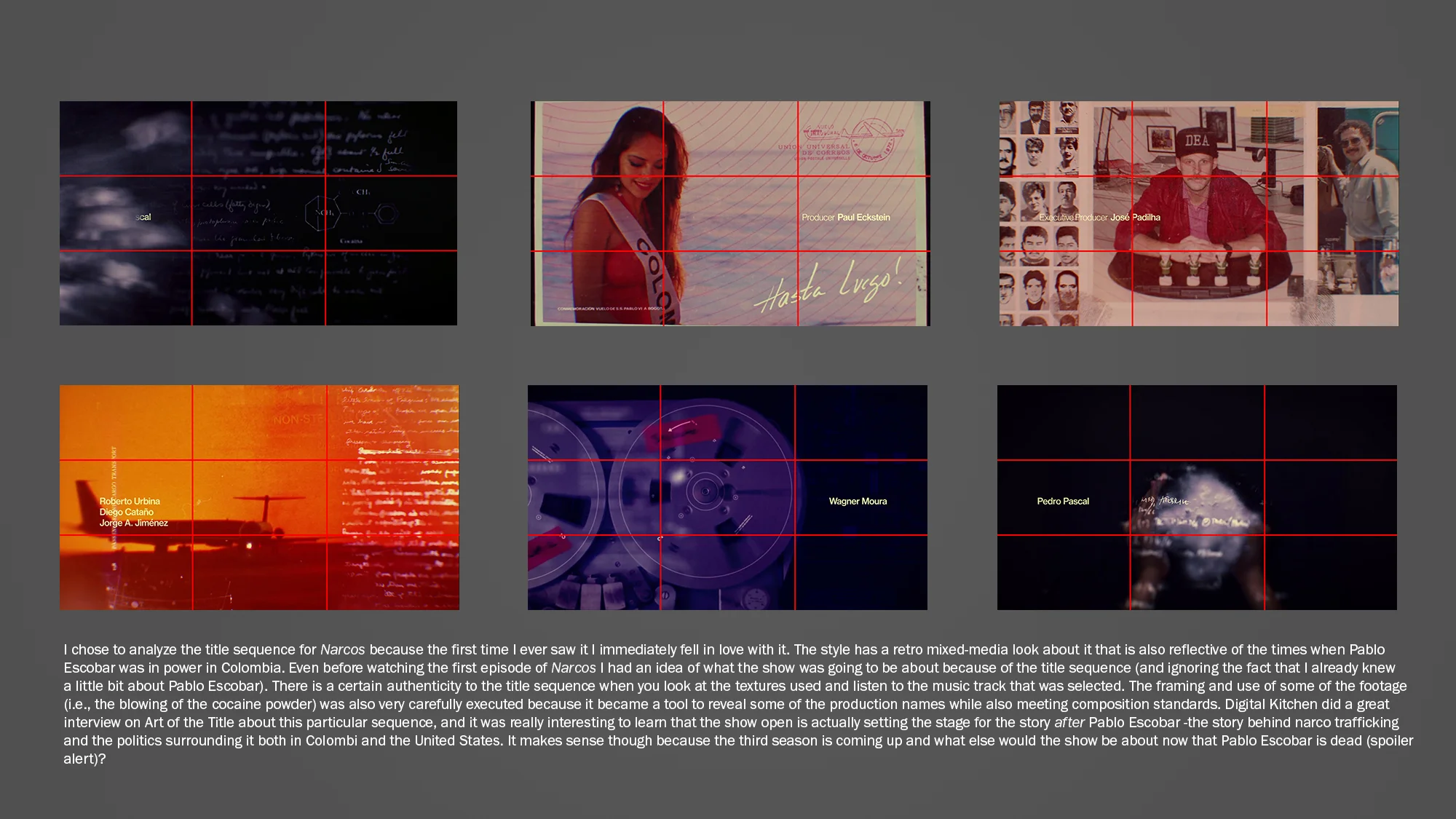
Gabagool and mutz aside, the more I got involved in my career in television, the more I took an interest into title design in particular, which ultimately led me to Ash and his beautiful work. He has been an inspiration ever since, and I have already learned a lot from him in the short amount of time that I have become a Learnsquared student. As a student of the Main Title Design class, I've been tasked with several homework assignments, the first one involving analyzing some of my favorite title sequences of all time. The Sopranos was not one of the chosen ones because I ended up focusing on some more graphic design focused pieces. Feel free to take a look at my analyses of the ones below, and stay tuned for more to come from my journey as a student in Main Title Design.


