• Work
  • About
  • Reel
  • Media
  • Blog
  • Studio

CAROLINE A. LE

Animation + Motion Design Portfolio

  • Work
  • About
  • Reel
  • Media
  • Blog
  • Studio

Amor: A Passion Project

Sometimes when your mind runs wild with endless ideas you need to get out there and make them happen instead of waiting for the right moment to do so. No ifs, ands or buts about it. And that was just the case for this passion project of mine.

For about a year or two now, I knew I wanted to work on a fun dance themed project with some friends and colleagues outside of work. I have always imagined working on a piece that utilizes different and dramatic frame rates, glowing and natural visual effects, and ornate choreography, but for the longest time my daily routines, commitments and freelance schedule precluded me from pursuing it. That changed this past May when I found out that a friend of mine knew some really amazing dancers that were interested in helping me with the idea. With summertime quickly approaching and the many weekend excursions, barbecues, weddings, vacations, beach trips, and get togethers that come with it, we decided it was the perfect time to tackle the video.

Amor Location
Amor Location

Location scouting still

Amor Handlettering
Amor Handlettering

Logo design progress still

Amor VFX
Amor VFX

Production still

Amor Logo
Amor Logo

Final logo design

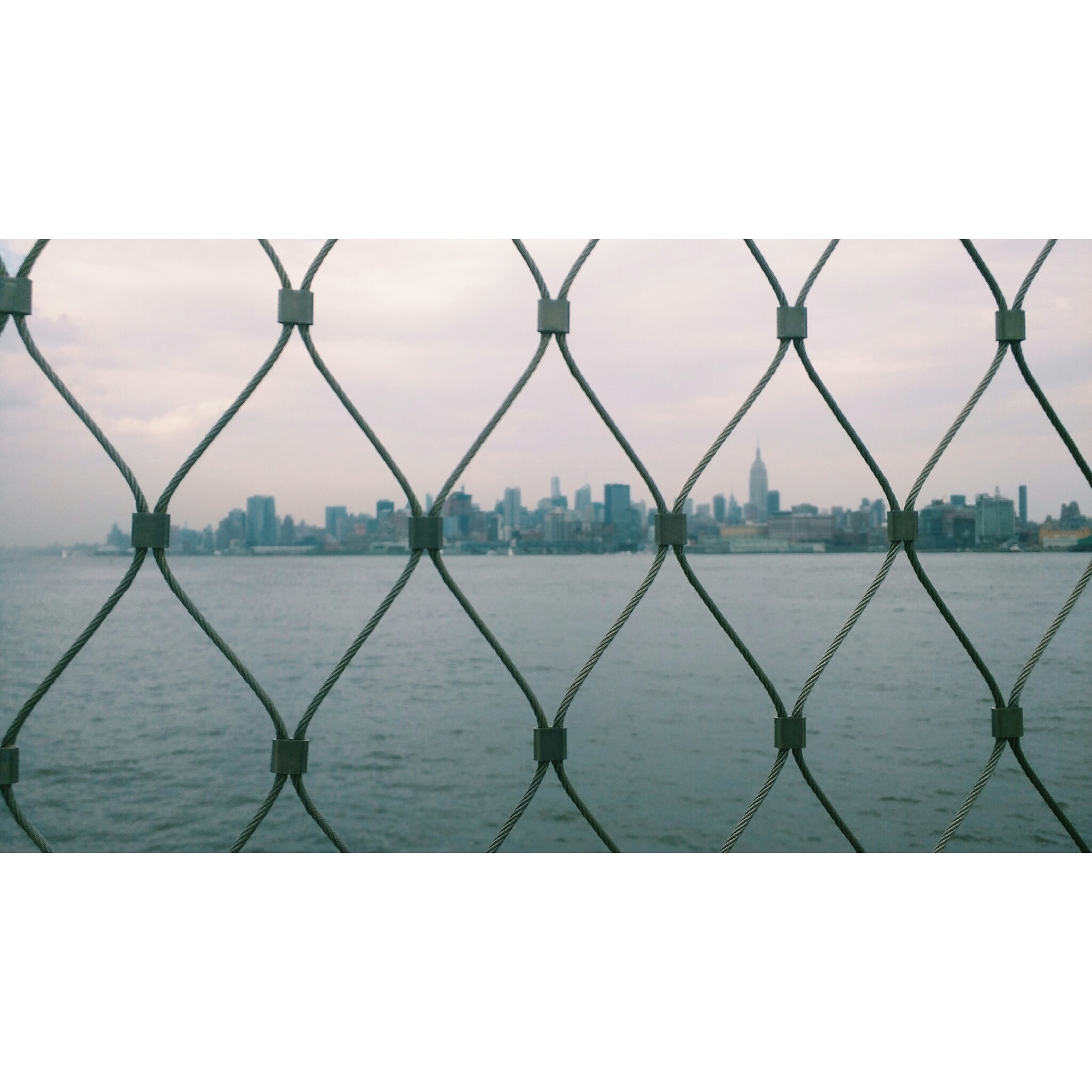
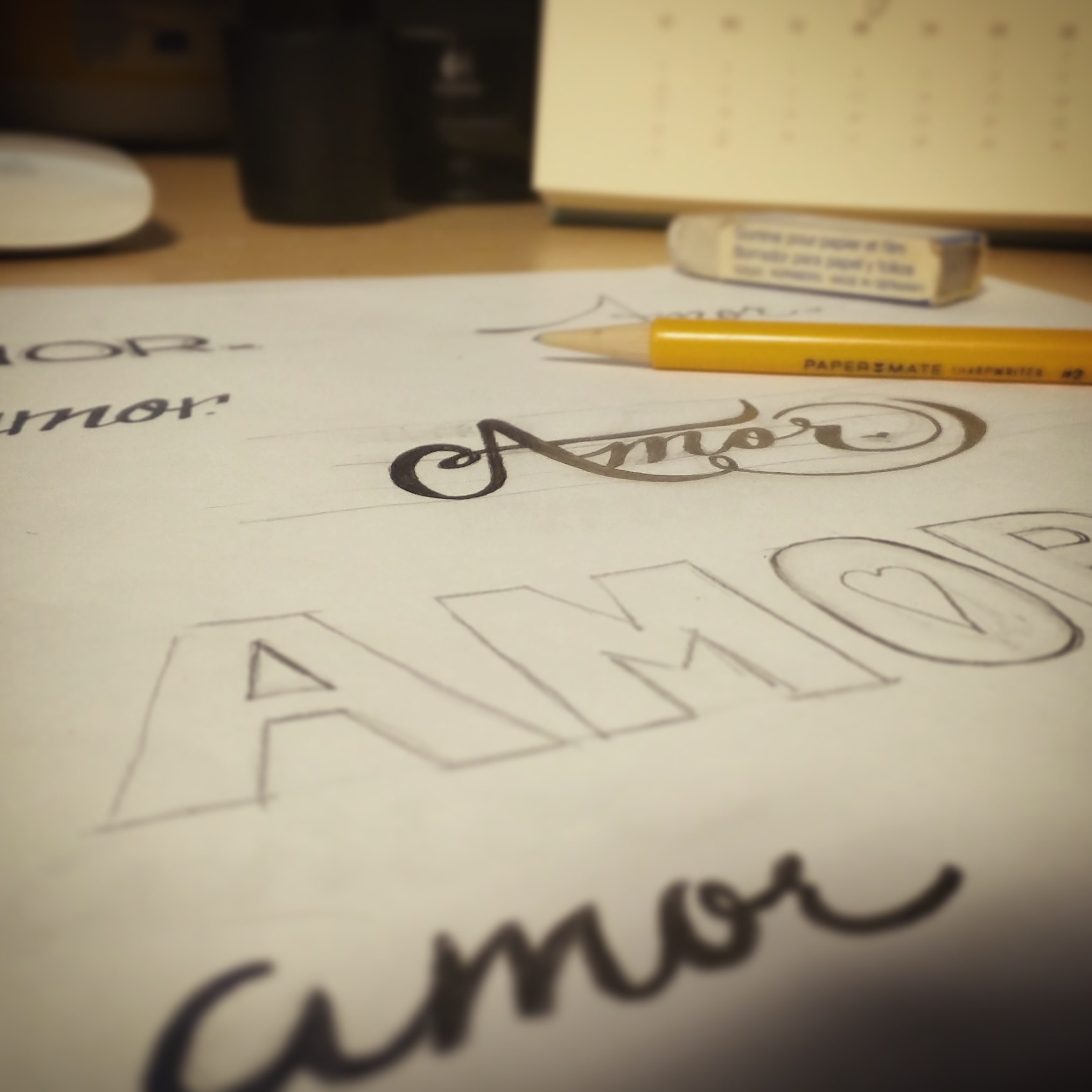
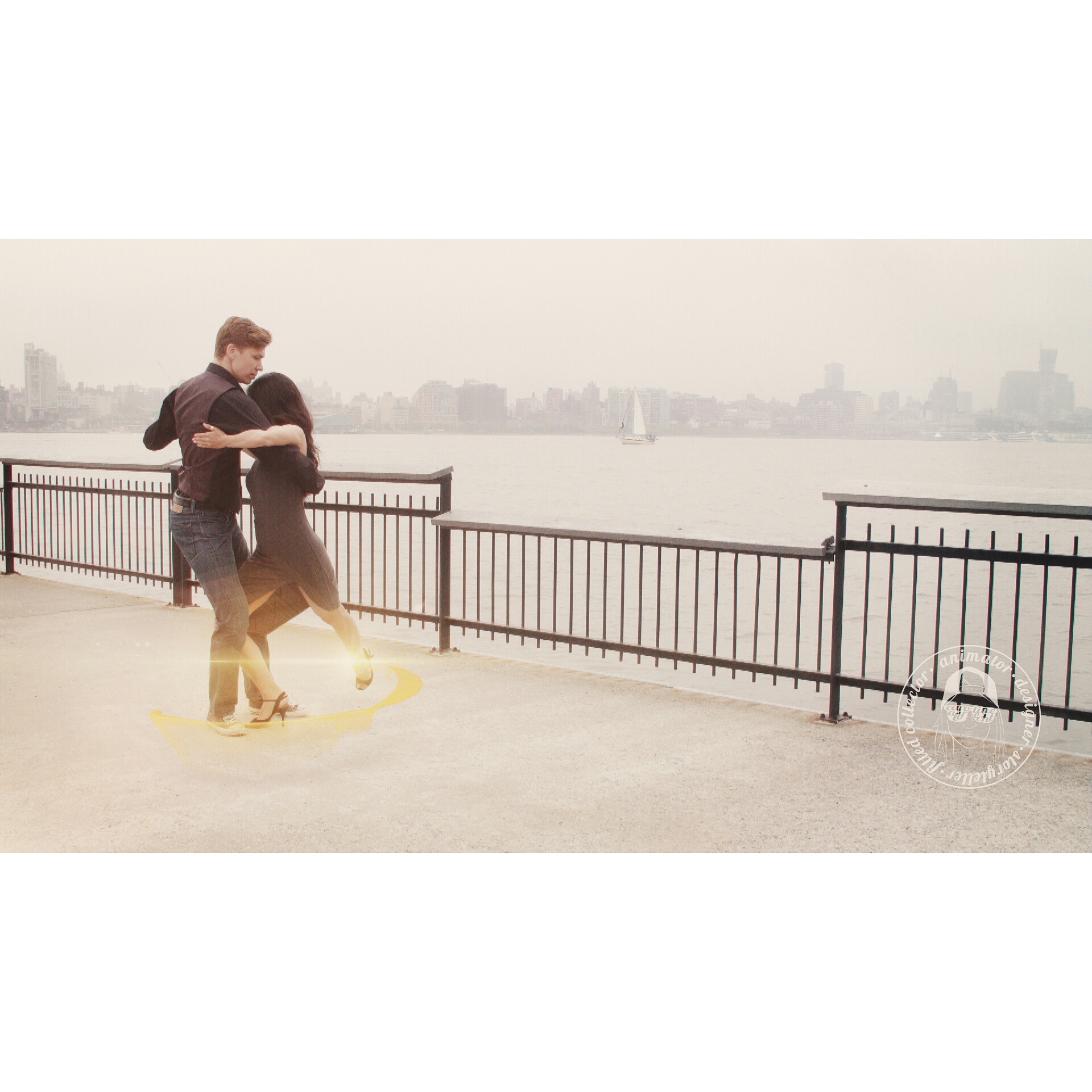
So what is the idea behind the dance-themed piece? Amor, as its name suggests, is a short story of all things love. People mistakenly only associate love with people, but the truth is love can define many things including, but not limited to, one's passion for a hobby or art form, an object, a sensation, an act of perseverance or, as part of this particular story, the enchantment of a city. It is an emotion that can define relationships, and it is the kind of love we feel and associate with our family, friends and loved ones. It is an undying and infinite kind of love. It has no shape or color, and it has no boundaries. But it is without a doubt beautiful and everything that is touched by it is cloaked with its profound beauty. This piece tells the story of two people defined by the many facets of love -their love for and commitment to one another, their shared love of dance, and the love of their home, New York City.

While the purpose of this project was to capture the broad definition of love, it was also meant to be a way for the team to practice certain techniques and skills that we rarely have the time to incorporate into our day-to-day work or on our client-based side projects. For me though this project continued to bring out the theme of love because not only am I passionate about what I do for a living, but I really enjoy learning, and this project without a doubt taught my friends and I a lot.

From the initial storyboards all the way through to post-production completion we learned a ton. I personally learned a lot about location scouting, licensing, production pipelines, rentals, schedule coordination, camera and location limitations, and consequential variables such as the weather on overall planning. I studied light and its interactions with surfaces and materials immensely for my visual effects work, and therefore, learned more about a subject I thought I knew fairly well. I learned a great amount about color grading from Jose our editor/colorist. I learned a lot about choreography and different styles of dance from our dancers Alexey and Aki, production and event photography from Stefania, and I hope my teammates learned a lot from me in return, as well. In the end and given our production constraints (i.e., two cameras, two cards, change in weather forecast, foot traffic, environment, etc.), we were very pleased with the overall outcome and what we were able to achieve with the limited tools and resources we had. It was a job well done all around.

While it was a great learning experience for all of us we most importantly had fun. We had a great time collaborating and creating the video together without worrying about an impending deadline, and I couldn't have asked for a better group of people to work with on this project than these guys. And as I say that I would like to say thank you again to everyone who made this project come together seamlessly. I hope you all enjoyed working on this piece just as much as I did. I look forward to working on more projects with you guys, and everyone else who is passionate about telling a story.

Find out more about the team and their talents/expertise at the links below:

Stefania Orru

Jose Duran

Alexey Gavrilov & Aki Kudo

Watch the full video here.

lights/fog/rain/camera/tango πŸ‘‰ fun morning with @cbalbrecht @josetherover @gavrilovdance

"lights/fog/rain/camera/tango πŸ‘‰ fun morning with @cbalbrecht @josetherover @gavrilovdance"

πŸ‘†above photo by @stefferonipizza

tags: dance, vfx, nyc, love, handlettering, color grading, film, choreography, photography
Tuesday 08.04.15
Posted by Caroline Le
 

Art Challenge Recap

Yesterday I completed an art challenge that was passed along to me six days ago by a very talented colleague and friend of mine, Tim Mrozek, and I wanted to summarize and recap the experience from start to finish.

The concept was to either create or share three pieces of original artwork for five consecutive days to showcase your talents while also tagging a new artist every day in order to pass along the torch and generate virality. People chose a variety of of tools to craft their art work. Some people sat down with a pencil and paper while others digitally drew texture maps for character models in photoshop. Some even chose to throw in some photography samples, as well. There was no single way to approach and complete the challenge which was refreshing. Below is a summary of the five days:

Day 1: I decided to go the fine arts route for my first day and did a few quick sketches of some of my favorite (sweet) places in NYC. The following image is a picture I took of those sketches that highlight City Bakery's famed hot chocolate, Dough's delectably huge and delicious donuts, and Morgenstern's legit finest and tastiest ice cream in the world. As you can see I have a major sweet tooth. I was also certainly feeling the recent impacts of giving up chocolate for lent a few days prior, thus, these sketches filled that void temporarily.

Day 2: The second day was probably my favorite because it was also a special day, Paul's birthday, and I wanted to do something that related to the two of us. Two years ago we took a trip out to San Francisco to see the sites and meet up with close friends, and there's no question that we took many pictures while we were there, too. I found a picture from that trip and decided to draw it in Photoshop to practice lighting. In my personal opinion I think the lighting on me may be slightly off, but his portrait came out perfect! As the saying goes, "practice makes perfect," and I'm intrigued by this drawing to practice this technique again very soon. Overall, I was very happy with the outcome, and especially because I had only spent about an hour or two drawing it.

Day 3: For the third day of the art challenge, I decided to step away from both my physical and digital canvases and approach my work from a different perspective. I decided to share some photos I had taken a few weeks earlier during a Valentine's Day date to the Top of the Rock and the Lego store ...and dinner of course! (those photos didn't come out as good as these did unfortunately) I took these photos with my Nikon D7100 and a 24mm lens. Out of a pile of about twenty photos, I ultimately chose these three because the framing was distinctly different in each of them.

Day 4: Inspiration for the next set of drawings/designs came from a conversation I had had with a coworker about breaking my arm in college ...and my very short lived breakdancing career, too.  That's a tale I'll save for another day, but as a result of our conversation and reminiscing some, I created the following pieces in Photoshop. I refer to them as a series of 'freezes' since each drawing showcases a different breakdancing freeze while maintaining the same stylization throughout and also using a different color palette to make each one unique. Below was the outcome.

Day 5: The last day was another one of my favorite days because this time I turned to some of my favorite third party motion graphics and effects plug-in's that are part of the Rowbyte and Red Giant families. I also decided to focus on abstract forms. The first of the three abstract pieces, created with Plexus, was meant to display the beauty of geometric shapes and forms (i.e. lines, vertices and polygons). The second abstract piece, created with Particular, was an exercise in displacing particles while also establishing an appropriate depth of field with a 3D camera to achieve a subtle bokeh effect. The third abstract piece, created with Mir, was meant to focus on the interaction of light and different materials. The results were very different from one another and I was really happy with how they all turned out in the end.

Not to sound redundant but there is a reason why a challenge is well, challenging, because it allows you to step out of your comfort zone and practice talents and skill sets that you don't use every day. Most importantly though it forces you to learn. Whether it is to learn something entirely new, to continue practicing something or simply problem solve, the desire to learn is the single most important thing that encourages us to outperform ourselves each and every day. One should never go a day without learning something new no matter how big or small a challenge or lesson may be.

And because you are reading this, I now challenge you, not to a five day art challenge, but rather to a daily challenge in hopes that you find something new and exciting to practice or keep up with to empower yourself and the people who surround you.

Cheers!

tags: art, after effects, photoshop, trapcode, plexus, sketching, drawing, design
Wednesday 03.11.15
Posted by Caroline Le
 

Photoshop's 25th Anniversary

On February 18th, Adobe Photoshop turned 25, and while that was two weeks ago already, I continue to find awesome articles, videos and imagery that pay homage to the legendary software almost every day. I'm sure by now everyone has seen this video, along with the Behance Collection of featured animated artwork, that focuses on the evolution of such a revolutionary software that we've known and loved for the past quarter of a century.

There are plenty of platforms out there that are showcasing their Photoshop Best's including the famed educational platform, Lynda.com with its tribute page and series. As I'm sure you guessed it, Lynda offers a wide range of Photoshop tutorials -everything from photo manipulation to graphic design to 3D -but the cool thing, at least I think, about Lynda's tribute page are the Insight & Inspiration and Retrospect sections that share inspirational stories from multiple artists and take a look back at the transition from the days of analog design to digital design. In fact, you can even find some pretty cool "Making Of" videos that reveal how certain artists created their illustrations using Photoshop.

Photoshop-Splash-Screens-Through-the-Years.jpg

The Next Web goes even further by creating sequences that show the evolution of the icons, tool bars, splash screens and box shots over the past 25 years, too.

Adobe itself even dedicated a page to the software's 25th anniversary by highlighting a lot of talented artists' works as well as featuring the most creative visual artists under the age of 25 on its Instagram feed. You would think by looking at a visual timeline of the product that Photoshop has been around much longer. Isn't it amazing that in a mere 25 years it has gone from displaying grayscale images to supporting 3D printing?

A milestone nonetheless, Photoshop continues to simultaneously push the boundaries of the creative and technology worlds, and with that said, we can only imagine how different and revolutionary it will be in the next 25 years. To the many many engineers, programmers, artists, filmmakers, designers, photographers and developers, while we are celebrating 25 wonderful years of Photoshop we are also celebrating YOU and the relentless power of creativity to continue to create such beautiful artwork and develop such concepts like Photoshop every day.

Dream on!

tags: design, photoshop, adobe, art, technology
Wednesday 03.04.15
Posted by Caroline Le
 

WIP: Minkus

books1.png

I told you I would be sharing some work in progress with you all, so here it is, the first of many updates on my current character project. It has been a couple of years since I've worked on a character animation and, well, I felt it was time to jump back into it. I am using this character as an opportunity to dust off some old skills and learn some new ones, too.

Every character starts back at the drawing board. For this project, I took the time to actually sit down and think of a few possibilities for potential monsters. I began by messing around with different shapes and sizes, and created a few different concepts around them. The result was a variety of creatures -some plump, some lanky, some short, some tall -but the recurring features I noticed in all of them were elements of "goofiness" and "cuteness," both of which make for a generally likable character. I decided to play off of those more and went back to the drawing board again to refine my cute army of monsters. Due to a popularity contest amongst friends, I went with the hairy looking fella with big ears, rotund figure, protruding fang, and short stubby limbs. He was going to be my star.

Before I thought about how to animate him I first had to think about his personality. He was definitely goofy and cute -at least I thought he was -but those couldn't be his only characteristics. I knew he had to tell a story. What was his personality going to be like? I started to act out some reactions he might have, how he might walk, what expressions he might make with his face and ears, or how he might talk. I started looking into how to his body would move based on a dynamically drawn line of action. Then I focused on his simple mouth. The way I drew him made him look like he was about to say something, or sounding out the letter "M." That's when I figured out his name, Minkus, he was practically saying it to me. I continued looking at him and felt as though he had a sincere face and the stature of a docile creature. He was harmless. From these musings I drafted my attitude sheet.

I'm sure I'll be revisiting the attitude sheet over the course of this project by either adding more poses or subtracting some. I have no doubt that I'll also experiment with different color combinations before I select his true fur color, too. I feel like this is a good start though, and it is refreshing to use a pencil and sheet of paper again especially because most of the work I create is computer generated. I have enjoyed going back to the fundamentals -the basics of squash and stretch, the effects of secondary motion, and the importance of exaggeration -and it has been a lot of fun reviving old skills and techniques. I hope to refine Minkus even more in this next stage and prep him for part two where I  will begin sculpting him in 3D via ZBrush.

I am constantly thinking ahead around the bigger production of Minkus but I know right now I have to focus on the absolute very beginning. There's no doubt that I am already thinking about how to sculpt him, create his skeleton and animation rig, tackle his fluffy fur, etc., however, I know I need to take a step back because I know how important it is to dedicate significant attention to character development. I'm learning a lot in these beginning stages, as well as the overall process, and look forward to learning more throughout the project.

β€œComputers don’t create computer animation any more than a pencil creates pencil animation. What creates computer animation is the artist.”
— John Lasseter
Thursday 01.22.15
Posted by Caroline Le
Comments: 1
 

Animation 101: How Animation Works by HouseSpecial

Today's post is going to be a rather short one because, well, the video speaks for itself! HouseSpecial, an animation studio in Portland, OR, put this spot together a couple of months ago for Indeed.com that was also part of a bigger in-house CG short. It is the perfect visual representation of what goes into animated sequences, and lists some of the roles that exist in the industry, too. Plus at :30 long it's short, sweet and to the point. Check it out below, and if you're looking for the full short, watch it here.

"How Animation Works" Client: Indeed.com Agency: Mullen Watch the full short here: https://vimeo.com/105788896 Spot Credits: Production/Animation Company: HouseSpecial Creative Director: Kirk Kelley Executive Producer: Lourri Hammack Animation Director: Dan Casey Senior Producer: Zilpha Yost Production Coordinator: Alix Iverson Designer: Alan Cook Lead Editor: Michael Corrigan Flame Artist: Rex Carter Nuke Compositing/Lighting Artist: Matthew Reslier Animator: Greg Kyle Editor: Cam Williams Assistant Editor: Dino Coons Production Assistant: Emma Van Halsema Audio Post and Mix: Soundtrack Based on a short film directed by Kameron Gates Brand: Indeed Senior Vice President, Marketing: Paul D’Arcy VP, Corporate Marketing: Mary Ellen Duggan Spot Title: How Animation Works Agency: Mullen Chief Creative Officer: Mark Wenneker Executive Creative Director: Paul Foulkes Creative Director: Jon Ruby ACD/Copywriter: Nick Mathisen ACD/Art Director: Lisa Mathisen Exec Director of Integrated Production: Liza Near Director of Broadcast Production: Zeke Bowman Senior Producer: Mary Donington Account Director: Cheryl Laundry Senior Account Executive: Katherine Meers

This is a very well put together CG piece with incredible character work, beautiful lighting, great texturing, solid effects, and gorgeous environments. Hats off to you, HouseSpecial! I look forward to perusing more of your work.

Enjoy! Caroline

Monday 01.12.15
Posted by Caroline Le
 
Newer / Older