• Work
  • About
  • Reel
  • Media
  • Blog
  • Studio

CAROLINE A. LE

Animation + Motion Design Portfolio

  • Work
  • About
  • Reel
  • Media
  • Blog
  • Studio

Main Title Design: Compositing 3D Renders

Fun fact: I love baking bread. I can’t eat bread, but I absolutely love to bake it. There’s a meticulous science behind it, and if done right, it produces delicious results. Baking bread often involves a lot of steps, the most timely of which is waiting for it to rise multiple times, but every step along the way brings you closer and closer to a beautiful combination of a crisp shell and a soft pillowy crumb. Like all processes bread too involves a gathering of ingredients, assembling said ingredients under certain parameters and conditions, manipulating and shaping the resulting foundation, and giving that foundation some heat. I enjoy every part of the process, but it’s the last part, the part where you take out a fresh boule, loaf or roll and apply all the fixings, that I enjoy the most. Sure, bread should taste good if you’re going to eat it, but it’s the presentation more often than not that wins me over.

When it comes to motion design compositing is the fixings stage, the stage where the presentation (or film or show or commercial) really comes into being. Don’t get me wrong I love the entire production process of motion design as well, but compositing is hands down my favorite. It’s the stage where you get to apply all the color correcting, the lighting and lens effects, the extra atmospheric effects, and the stage where typography and visuals come together in the most beautiful way. Lesson 7 of Main Title Design was all about the fixings and making things sexy and pretty.

LS_FRAME1_V01-WM.jpg
LS_FRAME2_V01-WM.jpg
LS_FRAME3_V01-WM.jpg
LS_FRAME4_V01-WM.jpg
LS_FRAME5_V01-WM.jpg
LS_FRAME6_V01-WM.jpg

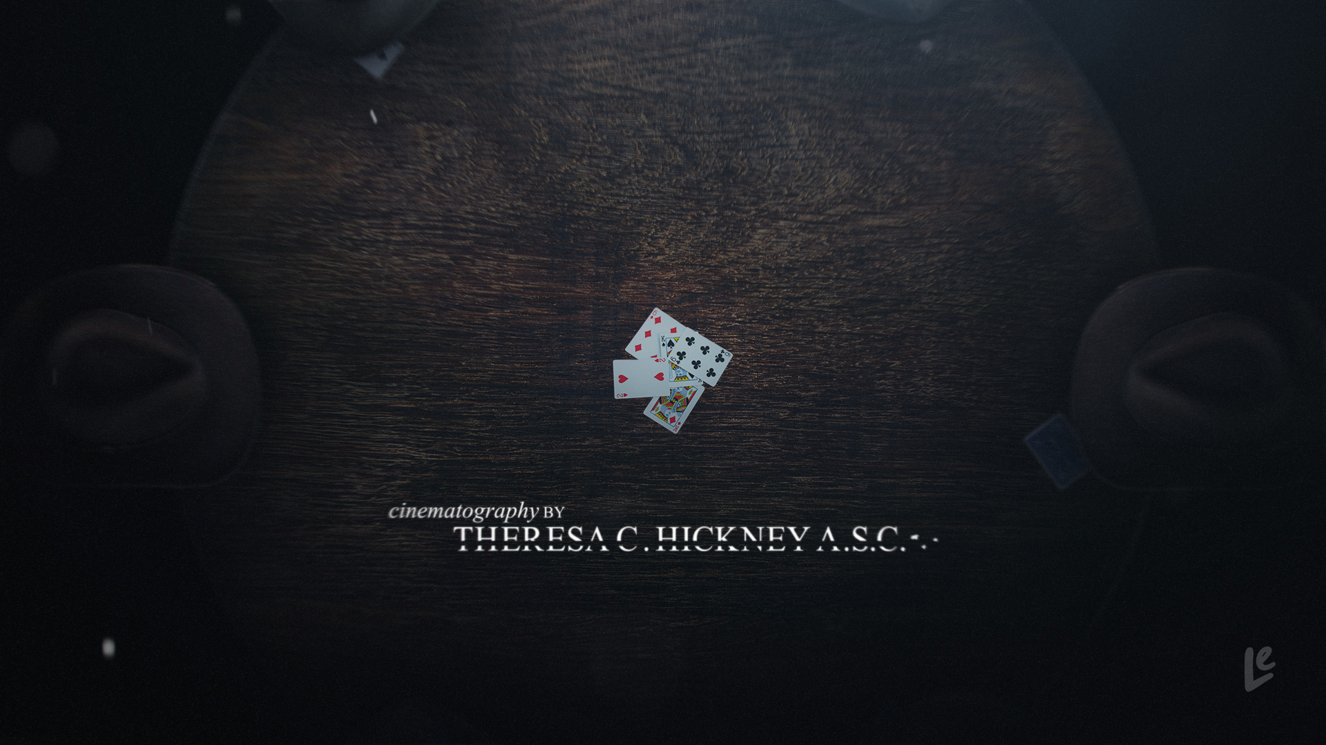
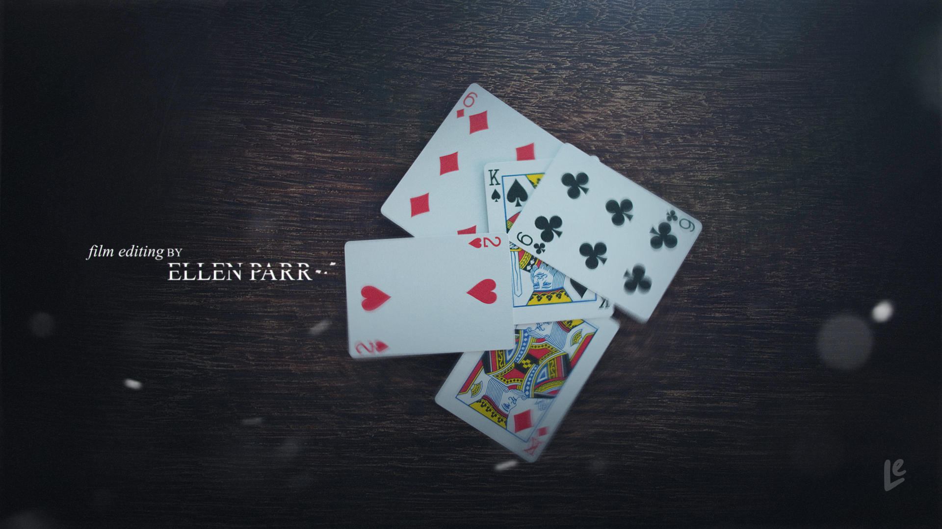
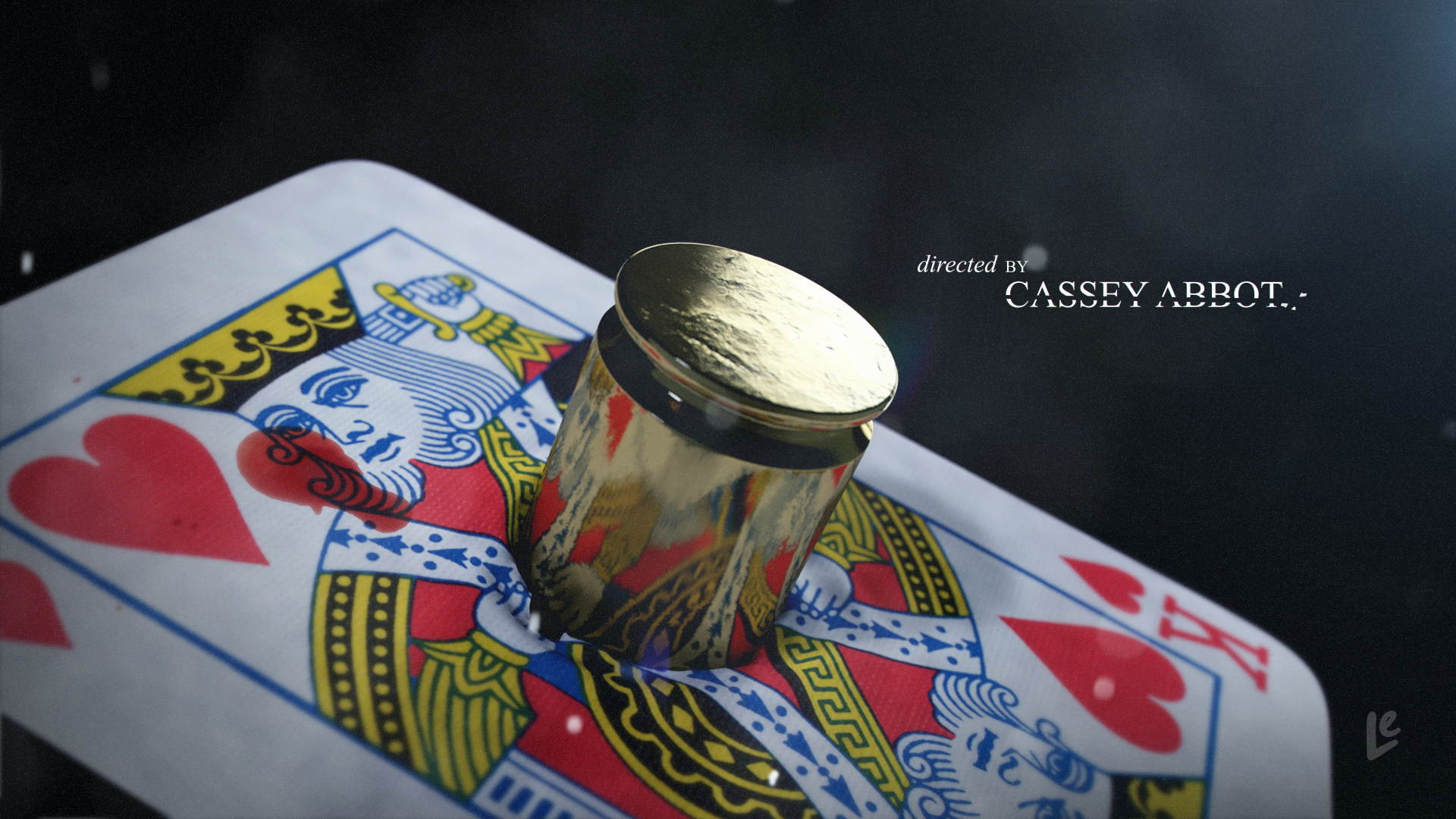
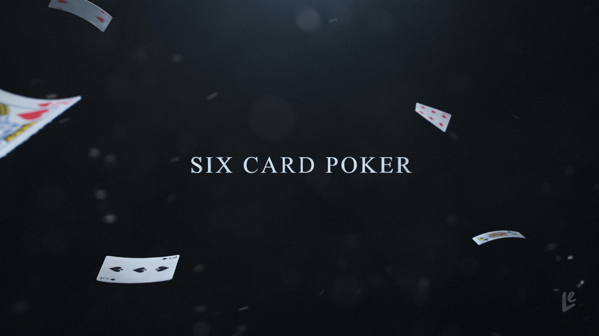
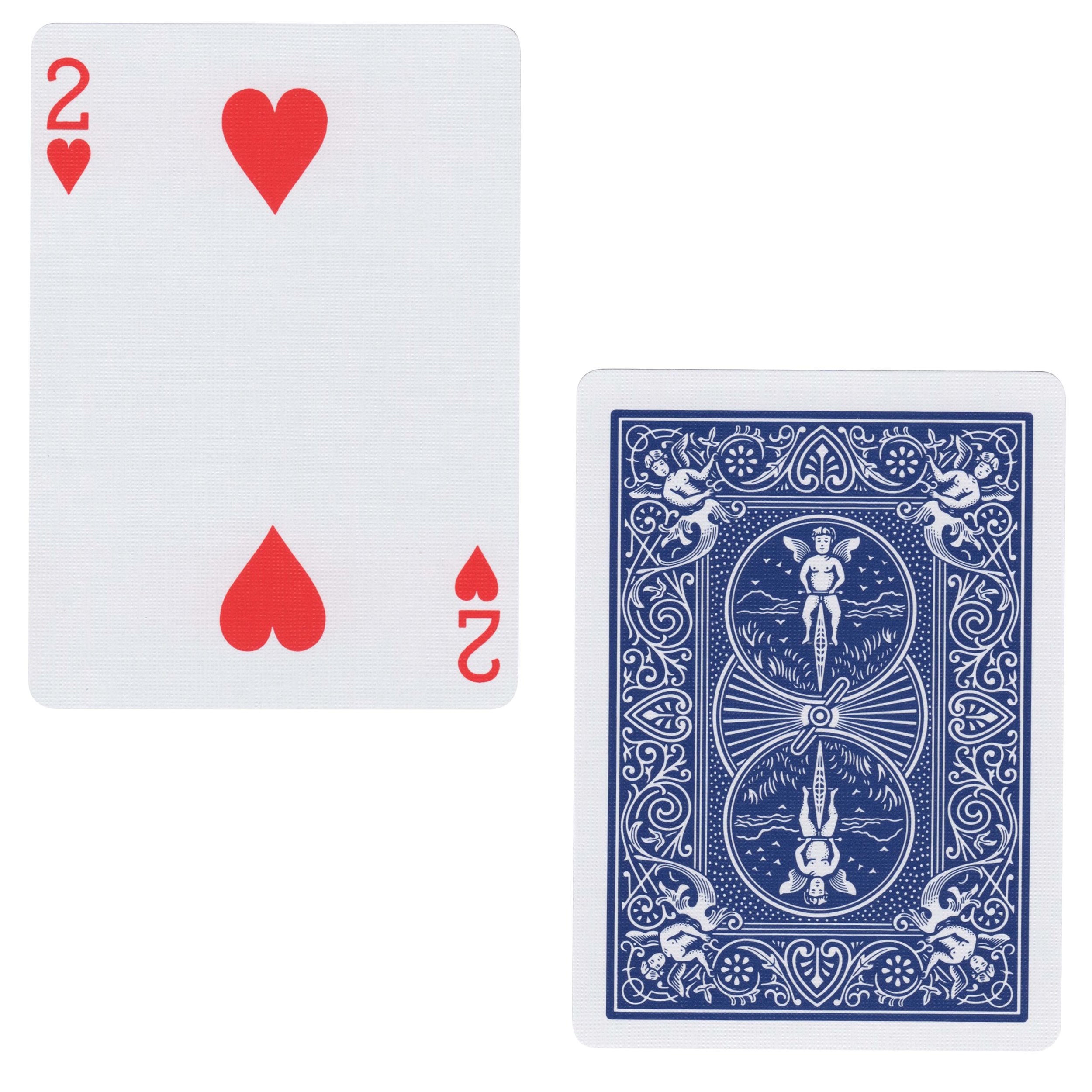
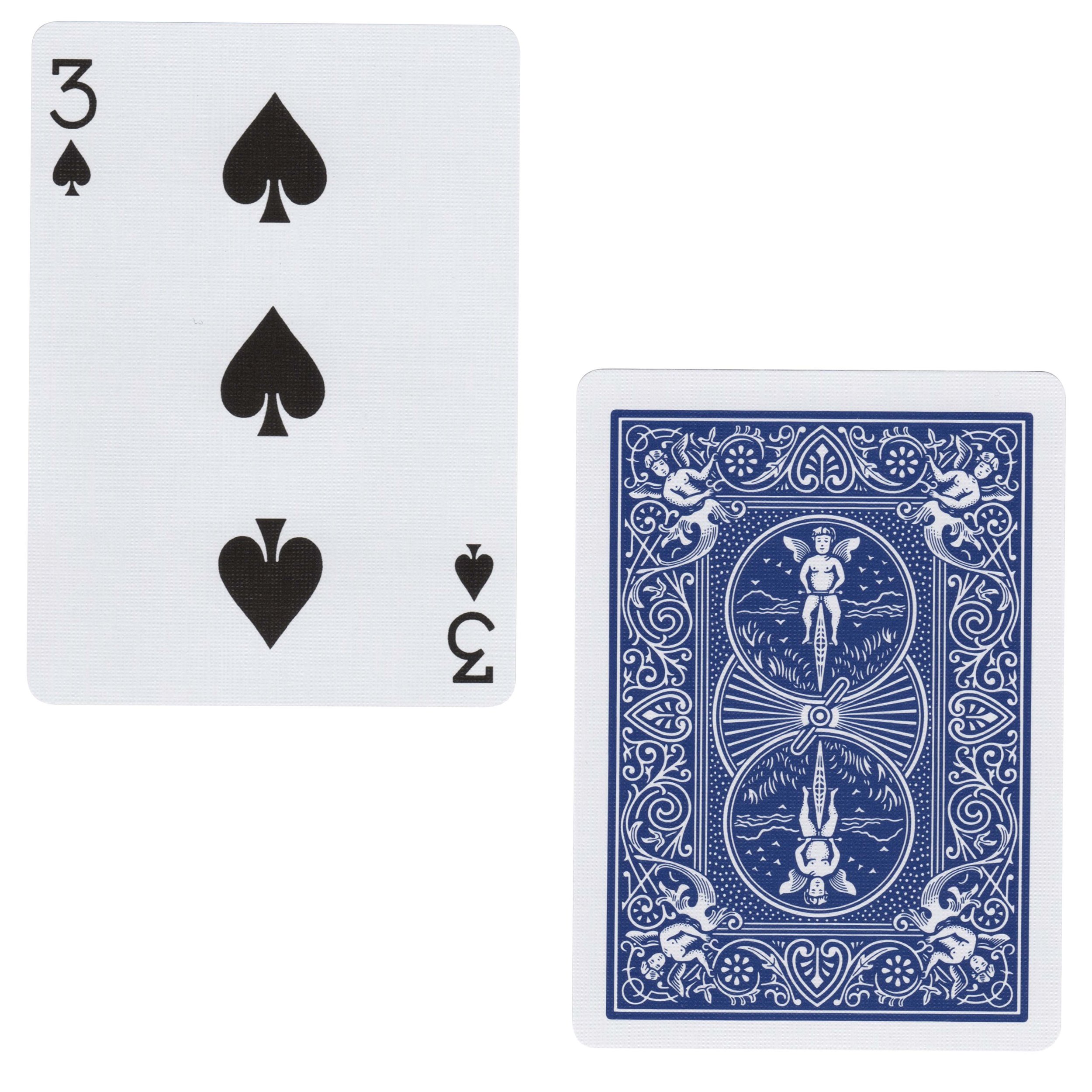
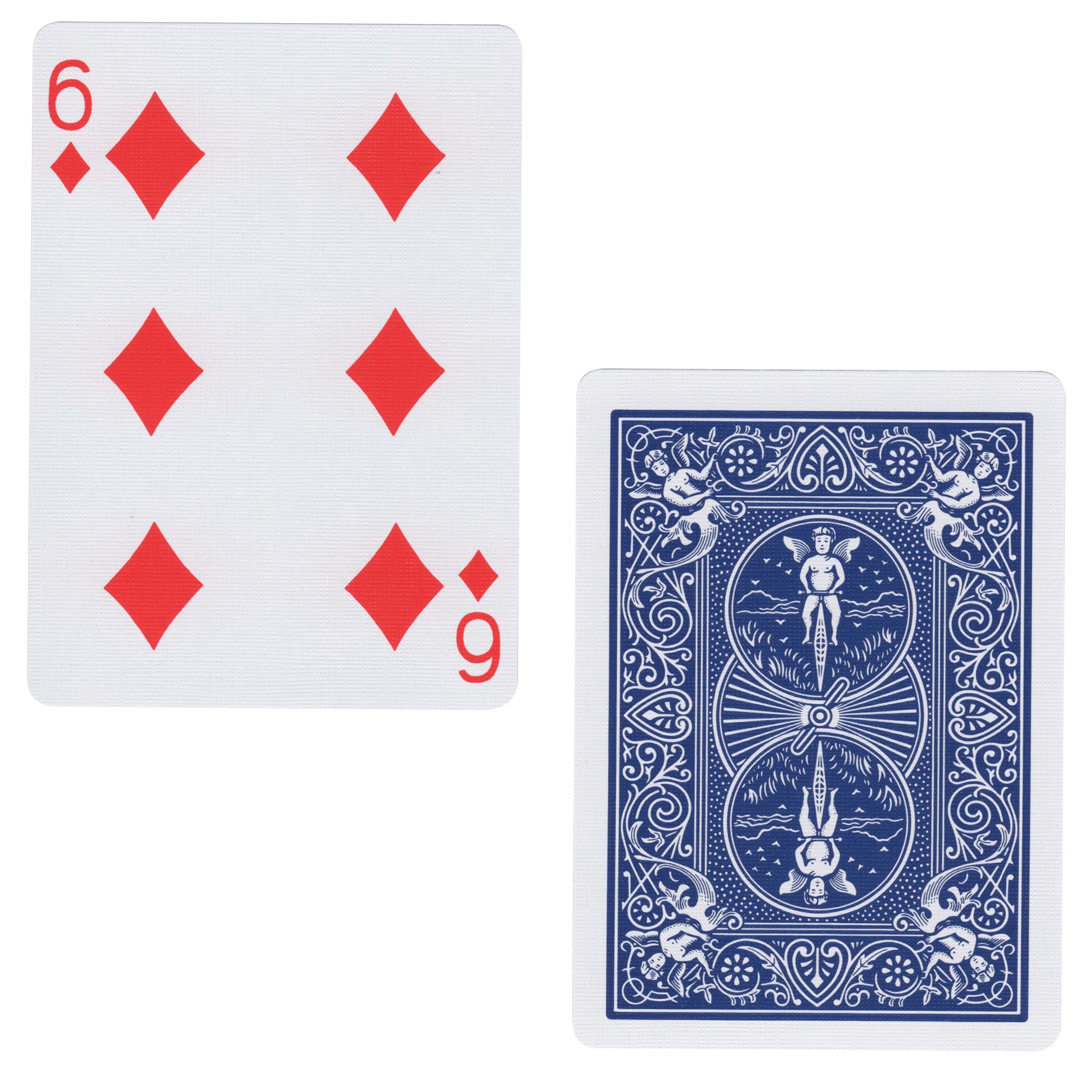
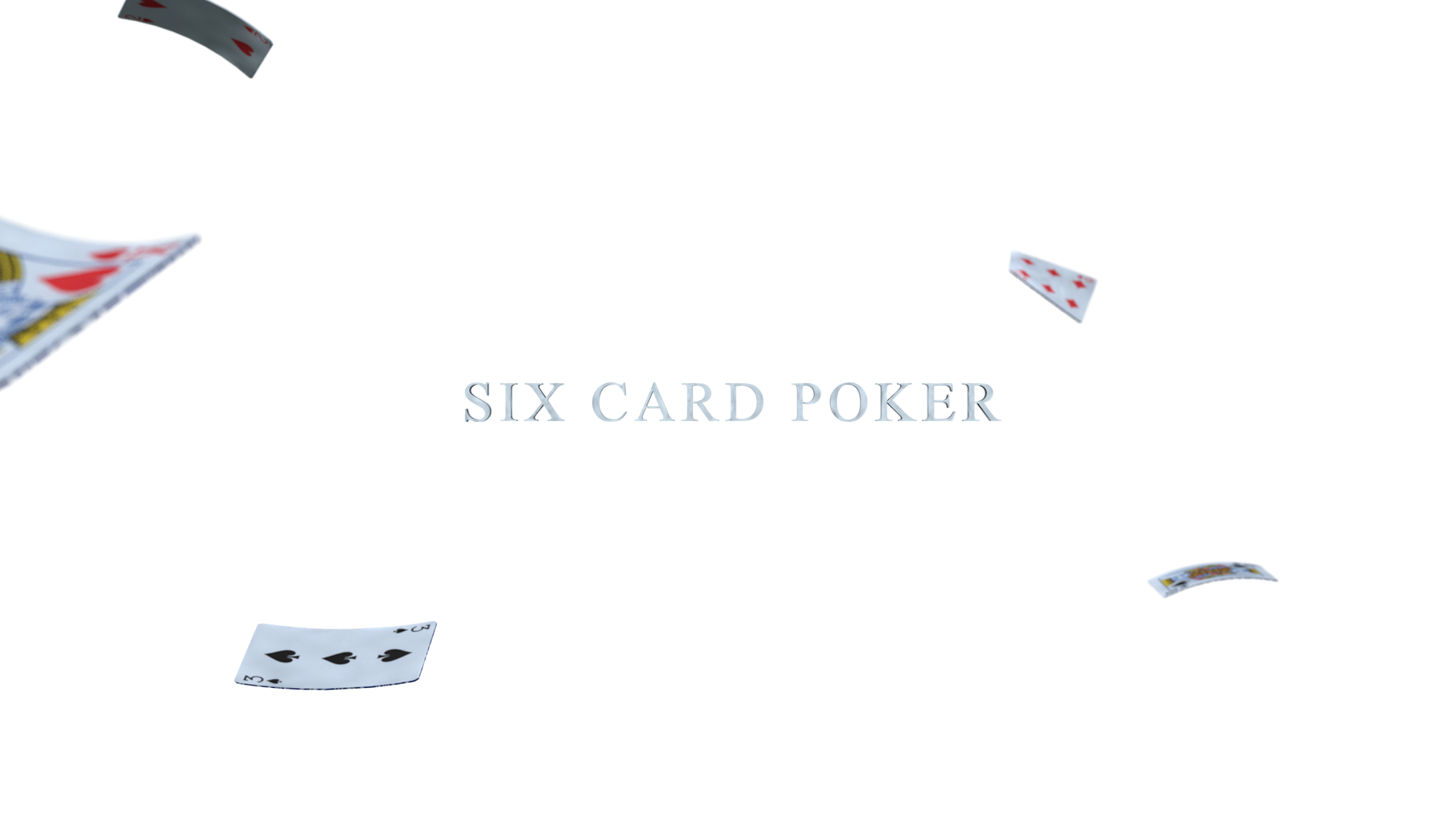
The original prompt for Six Card Poker read “six competing saloon owners play a game of cards which slowly escalates to violence.” A pretty vague plot breakdown as is, but vague enough to leave room for some creative freedom with the story and execution. My rendition of Six Card Poker wasn’t going to be your typical western. I had an unconventional mood in mind for this title sequence and wanted to make sure that I captured it correctly. This meant referencing my mind map a lot during the compositing stage so that my lighting and overall layouts conveyed something more modern and suspenseful in nature. I worked with a dark palette of blues and blacks and had the camera lens do most of the heavy lifting. I spent 99% of my time in Photoshop during this assignment and added any extra lens effects through After Effects. I also worked in Illustrator to bring the type to life. And instead of working with a pure typeface I brought some of the action from the frames into the titles, as well.

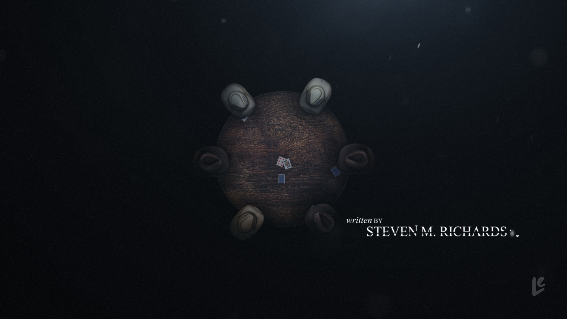
I also made sure that every little detail in each of the frames had a purpose in the bigger picture. It was the intentions that I had for every element, big or small, that drove the action in each of the frames. For instance, I didn’t want to have dust particles in a frame just because it looked cool. No, I wanted the dust to be part of the story. There’s a reason why there is little to no dust in the beginning of the frames because the game is just starting. It’s calm and every one of the players is playing their hand. However, the action at the end of the sequence is much different. There is a lot of debris along with the poker cards flying around because a fight has broken out.

The biggest challenge during this assignment was to avoid making the frames look very digital. Since I was working with assets of all different kinds, i.e., 3D elements, production stills, still imagery, recorded lens effects etc., I had to make sure that each of the pieces felt like they belonged together. Creating the right lighting was the key to making all of the pieces come together, and in the end I was very happy with the resulting frames. I’m excited to bring these frames to life in a full blown animated title sequence, but until then it’s time to create client presentation surrounding these frames, and I hope you’ll continue to follow along as I wrap up this course in Lesson 8.

Monday 01.28.19
Posted by Caroline Le
 

Main Title Design: Using 3D Software

It's been a minute since my last blog post, but a lot has happened since then. I finished my first Upfront season, experienced my first ever corporate merger, then experienced a business reorg because of said merger, shoveled my way out of the longest winter ever, and got soaked in the rainiest summer on record. As you may have guessed, Main Title Design took a backseat, but it's all good because in between all that life was throwing at me over the past year I have been dedicated to picking up where I left off.

The homework assignment for Lesson 6 was to create six 3D renders, for a new title sequence of my choosing that could be improved upon in Lesson 7. Instead of following the prompt verbatim, and selecting an entirely new sequence to work with I decided to go back to Lesson 2 and continue to build out the sequence for Six Card Poker. I'm happy I tweaked the instructions a bit and made them my own because I was very pleased with the end results even if they aren't prettied up to perfection just yet.

Based off of my original mind map from Lesson 2, I started out by creating a storyboard and used that as a basis for my 3D work. As I started to dive into Cinema 4D though I began to realize two things 1) some of the shots I sketched out were going to be very timely and potentially costly and 2) I needed to meet the requirements of the assignment even if I thought I might not use Cinema 4D as my only program. As a result, I started to narrow down which frames would be built in Cinema 4D and which ones would be entirely composited in Photoshop and/or After Effects. I'm happy I took this approach because my initial thoughts were correct -trying to build human figures and organic scenes would have taken me a very long time, and while I understand that that was the goal of the assignment (i.e. learning to use a 3D program inside and out) I also have a full-time job, so I knew I had to get smart with the assignment while also learning from it. Instead of continuing in Cinema 4D, and possibly wasting some precious production time I carefully went through my storyboard again and tried to build out a modified production pipeline.

Six Card Poker Storyboard-Revised.jpg

As you can see in the above image, I made several notes on my storyboard, and carefully reviewed every shot. I highlighted which shots made the cut, and of those shots, how many of them would in fact be built in Cinema 4D. The rest of them would be built from stock assets or production stills. I also ended up rethinking some of the shots altogether as I did this, which allowed me to take a step back and make sure that the story I wanted to tell was in fact going to be told, and that the themes mentioned in my mind map were coming to life. As a result, some original sketches got crossed out and new ones were drawn up as replacements. Ultimately, frames 5 and 6 ended up being the only frames I would build out in Cinema 4D. How could I possibly learn everything I needed to learn in order to finish the assignment by creating a mere two frames you ask? The answer is rooted in everyday problem solving. I wanted to become a more efficient designer and animator, and that involved adding some new tools to my toolkit while also building upon my strengths so that I could speed up my workflow and improve my storytelling skills.

BTS_SixCardPoker

As previously mentioned, cost was an obstacle with this assignment. I initially thought I might buy a couple of 3D assets from Turbosquid, but they ended up being more expensive than I thought. I then went to Pond5, and while there were some reasonably priced assets the next obstacle to overcome was trying to find a well-made model built in quadrangles instead of triangles, and one that would not have any textural relinking issues upon importing. The one asset that I've invested in for a while has been Adobe Stock, and when I began this assignment, my account had 15+ image credits available. Video and 3D models are extra add ons with an Adobe Stock account so again I stuck to the resources I had access to in order to get the job done. I was also thinking beyond Lesson 6 in terms of asset purchases, as well. I knew I eventually had to purchase some stock music for the end product, the fully animated Six Card Poker title sequence, so the Adobe library, my Nikon D7100, a 50mm lens, some playing cards, my printer and of course Cinema 4D, Photoshop and After Effects became my tools of choice once I gave myself the green light.

Once all of the planning was out of the way, it was time to jump back into Cinema 4D. I had several decks of cards on hand and went the practical effects route to create my card textures. I scanned them at a very high DPI for extreme close up shots so that the tangible features of the cards would be seen. The goal with these two shots was to mimic photorealism as much as possible. Once scanned I went into Photoshop to solo out the cards I wanted to use.

Card UV Lines.jpg 2 Hearts Card Texture.jpg 3 Spades Card Texture.jpg 6 Diamonds Card Texture.jpg King Hearts Card Texture.jpg King Spades Card Texture.jpg

With asset management out of the way the next step was to model the first playing card. I thought creating a card would be the easiest thing to do, but because I wanted the cards to animate a certain way I was very, very wrong. In terms of the model itself I thought the card was going to be a subtly rounded rectangular plane. And in terms of the texturing I thought I was going to have two planes unwrapped, but when I factored in the physics and dynamics of the card animation (i.e., a bullet ripping through the card) things got tricky quickly. I started out with a simple plane and used some planar mapping to get my UV lines. What I didn't realize though was that the texture that was going to be on front of the card would also be duplicated and reversed on the back. This wasn't going to work with my animation idea so the plane got scrapped initially.

Next I tried making a very thin rectangular box so that I had one texture for the front of the card and a separate texture for the back, but I ran into a problem with this approach, as well. One thing to keep in mind when creating any 3D model is to know that the model won't be a solid mass like a sculpture would be in real life. There is no substance or geometry on the inside of a 3D model and instead represents more of a shell if you will. This was the problem I ran into when it came time to animating the bullet ripping through the card. How was I going to get this to work as realistically as possible? That is an answer I am still searching for and welcome any and all suggestions from visual effects community ;)

LS_Frame5_Prerender_v02.png

Ultimately the work around that produced the best results was good ol’ cinematic trickery, a.k.a. using a single plane for the base model, using less manipulation on the card so that you couldn't see the back of the card, and focusing the camera angle on the front of the card where the bullet was going the rip through it. I also had to cheat and use just the front face texture of the card, which I knew was going to be duplicated on the back. I upped the geometry on the card so that the shards would be realistic enough upon impact from the bullet, and played with the depth of field so that you didn't notice the same texture was on both the front and back of the card as the shards flew away from the camera. This involved both manipulation of the depth of field and playing around with the speed and acceleration of the bullet as it animated over time, which was a sweet spot of about 20 frames for the animation. In order for these types of simulations to work as accurately as possible, as well, the card and bullet also had to be about the same size that they would be in a real world simulation. The card and bullet couldn't be too small or too big or else the physics wouldn't work properly.

The bullet model didn't just make itself either. I had to model that element, too, but it was a lot easier given it was the object doing all of the work in this shot. It was a lot easier to model because I knew procedural texturing was going to be my best friend in this instance, as well. Easy peasy.

LS_Frame6_Prerender_v01.png

For the last shot of my storyboard, I simply mimicked how a space might look if a brawl broke out and cards ended up flying all over the place (some foreshadowing of how this poker game ends). This shot was a bit simpler than the previous one because it just meant twisting and bending the cards a bit, and positioning them throughout the scene. The cards this time around though weren't simple planes because of the before mentioned texturing problem that came up. Although still not ideal I opted for the shallow rectangular boxes for this frame, and boy was this a challenge. Unwrapping and texturing the boxes was no easy feat either. Texturing a box is pretty much 3D 101, but the teeny tiny quadrangles that made up the sides of the box made for the most complicated unwrapping... ever. I ran into some problems when it came time to make the card textures because of my horrific UV unwrapping job. As a quick hack though I offset the textures on the back of the cards to fill up as much of the backside as possible. It was a tad messy, but luckily I have Photoshop and After Effects to correct that. When it comes time to animate this frame I will have to problem solve a bit more and maybe even go back to the drawing board in terms of unwrapping the UVs altogether.

I also ended up changing the title font while working in Cinema 4D, as well. Back in Lesson 2, I thought Verlag was going to be my font of choice when it came time to further explore this title sequence, but once I got into Cinema and started pairing the title with the scene, Verlag just didn't feel right. The obvious choice was to choose a font that resembled that of the numbers and letters on the cards, something more serif in nature, but still had the same weight and feel. So instead of Verlag I decided to use Times New Roman. I had some other fonts I was considering including Adobe Caslon Pro and Didot, but they didn't match the character of the playing cards. Times New Roman, a font we are oh so familiar with, was the perfect balance this title needed.

I don't want to drag this post on any longer, but I would be doing a disservice to you if I didn't mention one of the most important aspects of a 3D scene, a.k.a, the lighting. I prematurely lit both scenes in Cinema 4D based off of Patrick Foley's skillshare tutorial, and learned a ton from this dude as a result. Lighting can either be straight forward or immensely complicated based on the 3D scene you're working with, but in the end, it's the lighting that actually establishes the mood in any show or film. If you've ever seen anything done by Pixar, you'll know what I mean because the lighters at Pixar have mastered this art.

As you can see from this extremely long post, this lesson was super involved, and I commend you for reading this far especially if you have no idea what I just said. If I had to sum this post up in one paragraph though the general take away from this lesson would be that experimentation is the best mentor. A lot of decisions were made, then rethought, then put into practice again, and then inevitably rethought. It was a true real world experience minus the time constraint of a deadline. I felt like a designer, producer, director and scientist all rolled into one, and honestly, it was pretty awesome. This exercise also made me appreciate my work team (#TeamAwesome) even more, as well, because more heads are always better than one, and teamwork makes the dream work. Sure, it should come as no surprise to a modern motion designer that you are expected to wear multiple hats throughout a project, but true team collaboration is so much more efficient and often times produces the best results over a one man band.

I hope you will join me in the next blog post as I start to composite these renders and bring this title sequence to life. Stay tuned!

Monday 01.28.19
Posted by Caroline Le
Comments: 2
 

Main Title Design: Finishing Graphic Design

Back at it with progress on my rendition of the Ray title sequence in lesson five, and wow, am I digging the results. Isn't it amazing to find out what you're capable of when you're given the slightest push outside your comfort zone? That mindset was especially evident while working on this week's homework assignment, and I'm very excited to share the results with you.

Homework assignment five was an opportunity to build upon our sketches from lesson four and bring them to life in a sequence of four styleframes. I decided to choose one of Ray as a little boy, one of champagne as an indication of fame and success, another of a syringe depicting Ray's drug addiction, and lastly Ray's iconic piano because I felt they conveyed the overall story given the amount of thumbnails we were allowed to polish. The images I was working with to build my compositions were slightly different from the sketches I made in my last homework assignment, but I was pleasantly surprised at how the images pushed my animation concepts even further. More about this later on.

HW5 Font Selection_1100x1100.jpg

I knew the font choice for the titles was going to be the cherry-on-top for my rendition of Ray. It had to balance out the imagery, and at first, I thought a serif font would do the trick since I drew something similar when I was developing my sketches. Originally, I felt that a serif font choice spoke to the era in which the story took place, and thus, brought everything together, but I was pleasantly surprised by my choice of a san serif font instead. I ended up going with modern-looking Futura SC, and it made the composition complete. I played around with the layout several times within each frame, and enjoyed how it fit into the frames more so than a serif font. At first I couldn't figure out why I enjoyed it more than something like Bodoni. Sure, it created balance and was visually appealing, but I eventually realized that it helped establish the mood more than I anticipated. It gave off a serious tone with it's formidable structure, and really spoke to the seriousness of the frames I chose to design out. Not to mention with the title of the movie simply being Ray it became a bold choice even for three letters. Despite it being a bold and firm choice there was also something elegant about the way "Ray" was depicted, and I decided to give each of the titles a similar treatment. When playing with the cast and crew, I wanted the first name to feel the most important, much like Ray's, and therefore, made the first names of the titles a little heavier than the middle initials or last names. It may seem like a silly minor detail, but I thought it was an important decision that would help guide my audience's attention from one frame to the next.

HW5_FRAME1.jpg
HW5_FRAME2.jpg
HW5_FRAME3.jpg
HW5_FRAME4.jpg

As I continued to design each of the frames I wanted to make sure that the tone was consistent and that the irony that I talked about in last week's assignment resonated. By using a darker palette and enough contrast to create some drama I think I was able to successfully establish that theme and mood, and was really happy with the results. While working with the selected imagery, I found myself considering different animation ideas beyond what I had established in my initial sketches. For instance, I originally thought I wanted to create a transition between the champagne and the syringe using a sort of spinning move, with the aide of another frame in between, and I realized that I could simply use the fluid state of the champagne to transition to smoke and haze that would then reveal the syringe frame. The same goes for the transition from the syringe to the piano. I originally wanted another spin-type transition, but now working with the elements first hand, I prefer a more subtle cross transition instead. I don't believe the next class will focus on the animation of this sequence, but if it does I'll be curious to see how the animation comes together based on last week's sketches and this week's compositions. It's been a reward to see these frames mold from initial concept to styleframes, and if given the opportunity I would love to make it a complete animation.

That's it for this week. I hope you enjoyed the results of my exploration with recreating the Ray title sequence, and please stay tuned for more to come in the last couple of lessons of Main Title Design.

Wednesday 01.24.18
Posted by Caroline Le
 

Main Title Design: Graphic Design Basics

“Styles come and go. Good design is a language, not a style””
— Mossimo Vignelli

If that quote isn't mic drop worthy then I don't know what is because, let's be honest designers, this speaks so much truth, right? I found myself relating to it one thousand percent because it speaks volumes about the design and storytelling worlds. Good storytelling and good design always transcend. Period. And that is more or less what Vignelli is saying here. So before I begin this blog post I'd like to thank Ash for introducing his students/mentees to this man's brilliance, and thank Mr. Vignelli for his knowledge and commitment to the design community. It was a very worthwhile quote to start the lesson, and had a direct impact on this week's homework assignment.

Lesson four was an interesting introduction to design because it incorporated all of the fundamentals that you would expect, but also picked up where we left off in last week's class. Ash made sure that we incorporated everything we've learned thus far into this week's homework assignment, and I was impressed with some new habits I've already formed from four short lessons. I'm seeing changes in how I approach projects, and am pleasantly surprised at how quickly some of these new design habits have become part of my routine.

This week we were asked to create twelve thumbnail frames from one of our favorite movies, games or tv shows, and while I regularly go for the slap-stick humor based movies and tv shows (you know I'm talking about you, Euphegenia Doubtfire), I instead decided to create thumbnails for the movie Ray (2004), a biographical film about Ray Charles' life and career. The original creators, Taylor Hackford and James L. White, did a phenomenal job with this movie when it came out in 2004, and I just felt like I had to pay homage to it being a fan of Ray Charles' music and, of course, as a big fan of the movie.

Like the homework assignment from lesson three, I started this assignment by building a mind map of the premise of Ray. Whenever I had some time during the mind map phase I would pull up clips from the movie, and eventually had the movie on in the background so that I could really get to know the characters in depth, nail down the timeline, and absorb every little detail about the film. I was amazed at how well the movie held up thirteen years after its original release, which again, reinforced Vignelli's point about not only design, but storytelling, too. You'll find in the above mind map that I focused on a couple of different themes from the film, but the one theme that was the most prominent, and also presented a sense of irony, was Ray's disability.

At a young age, Ray's mother tells him to make sure nobody, including himself, ever turns him into a cripple despite his being blind. Ray obviously overcomes this since we know how successful of a musician he became, and what a pioneer he was to American music, but too much of a good thing can sometimes be bad. Ray's fame eventually led to drug use, abuse and addiction, and ultimately led him to a point of crippling disability despite all that he had persevered as a blind man. It took his wife telling him that "if you don't give up the needle you're going to loose your one true love, music, Ray," which finally got him into rehab, and ultimately back on the road of success. It seemed like a bit of a dark theme to pursue for the recreation of the title sequence, but at the same time, it was very human, and thus somewhat personable, relatable, and reminder that even in the darkest moments there is light.

ray original sketch

I decided to balance out some of the darker themes with lighter ones, and as a result, the ideas for my sketches highlighted a range of moments into a short synopsis of the movie. As I developed the sketches some more, I felt I was achieving the movie within a movie practice that I've seen exercised by some of my favorite production houses and media companies, and was excited to see it all come to life. Yet, as I was putting my original sketches together they inevitably started to change. I found out that certain frames were better in different positions, that certain ideas didn't resonate as well as I thought they would in the overall sequence, and that there were better ideas for some of the original frames I sketched. Below are the revised sketches that I made, and the final twelve that I'll be taking with me into the next lesson.

It's not much to look at this week, but man am I excited to get started on the design and composition of a few of these frames :) Hope you enjoyed today's recap, and stay tuned for more to come on this little exercise!

Wednesday 01.10.18
Posted by Caroline Le
 

Two-Oh-One-Eight

2018.jpg

Another year has come and gone, and just like that, it's on to the next one. Today I'm keeping it short because I know a lot of you are recovering from last night and/or getting your hustle on. Here's to wishing you all a very Happy and Prosperous New Year. May you continue to explore the world, excel in your career, welcome new chapters into your lives, but most importantly live your best life. I hope 2018 brings you all the fulfillment you desire. Keep on creating, enjoy the process and most importantly make every day count!

Monday 01.01.18
Posted by Caroline Le
 
Newer / Older