Back at it with progress on my rendition of the Ray title sequence in lesson five, and wow, am I digging the results. Isn't it amazing to find out what you're capable of when you're given the slightest push outside your comfort zone? That mindset was especially evident while working on this week's homework assignment, and I'm very excited to share the results with you.
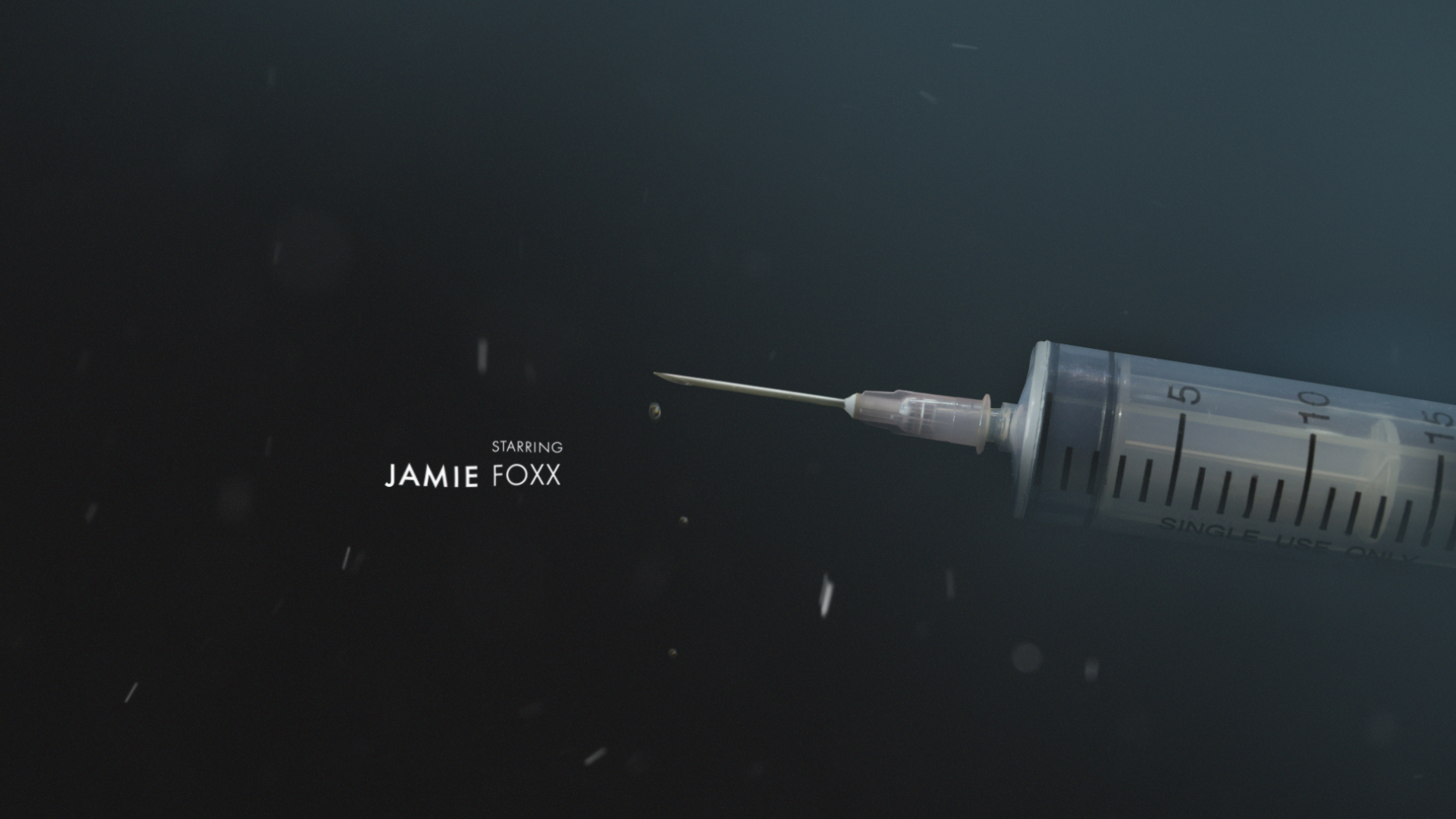
Homework assignment five was an opportunity to build upon our sketches from lesson four and bring them to life in a sequence of four styleframes. I decided to choose one of Ray as a little boy, one of champagne as an indication of fame and success, another of a syringe depicting Ray's drug addiction, and lastly Ray's iconic piano because I felt they conveyed the overall story given the amount of thumbnails we were allowed to polish. The images I was working with to build my compositions were slightly different from the sketches I made in my last homework assignment, but I was pleasantly surprised at how the images pushed my animation concepts even further. More about this later on.
I knew the font choice for the titles was going to be the cherry-on-top for my rendition of Ray. It had to balance out the imagery, and at first, I thought a serif font would do the trick since I drew something similar when I was developing my sketches. Originally, I felt that a serif font choice spoke to the era in which the story took place, and thus, brought everything together, but I was pleasantly surprised by my choice of a san serif font instead. I ended up going with modern-looking Futura SC, and it made the composition complete. I played around with the layout several times within each frame, and enjoyed how it fit into the frames more so than a serif font. At first I couldn't figure out why I enjoyed it more than something like Bodoni. Sure, it created balance and was visually appealing, but I eventually realized that it helped establish the mood more than I anticipated. It gave off a serious tone with it's formidable structure, and really spoke to the seriousness of the frames I chose to design out. Not to mention with the title of the movie simply being Ray it became a bold choice even for three letters. Despite it being a bold and firm choice there was also something elegant about the way "Ray" was depicted, and I decided to give each of the titles a similar treatment. When playing with the cast and crew, I wanted the first name to feel the most important, much like Ray's, and therefore, made the first names of the titles a little heavier than the middle initials or last names. It may seem like a silly minor detail, but I thought it was an important decision that would help guide my audience's attention from one frame to the next.
As I continued to design each of the frames I wanted to make sure that the tone was consistent and that the irony that I talked about in last week's assignment resonated. By using a darker palette and enough contrast to create some drama I think I was able to successfully establish that theme and mood, and was really happy with the results. While working with the selected imagery, I found myself considering different animation ideas beyond what I had established in my initial sketches. For instance, I originally thought I wanted to create a transition between the champagne and the syringe using a sort of spinning move, with the aide of another frame in between, and I realized that I could simply use the fluid state of the champagne to transition to smoke and haze that would then reveal the syringe frame. The same goes for the transition from the syringe to the piano. I originally wanted another spin-type transition, but now working with the elements first hand, I prefer a more subtle cross transition instead. I don't believe the next class will focus on the animation of this sequence, but if it does I'll be curious to see how the animation comes together based on last week's sketches and this week's compositions. It's been a reward to see these frames mold from initial concept to styleframes, and if given the opportunity I would love to make it a complete animation.
That's it for this week. I hope you enjoyed the results of my exploration with recreating the Ray title sequence, and please stay tuned for more to come in the last couple of lessons of Main Title Design.


