It's been a minute since my last blog post, but a lot has happened since then. I finished my first Upfront season, experienced my first ever corporate merger, then experienced a business reorg because of said merger, shoveled my way out of the longest winter ever, and got soaked in the rainiest summer on record. As you may have guessed, Main Title Design took a backseat, but it's all good because in between all that life was throwing at me over the past year I have been dedicated to picking up where I left off.
The homework assignment for Lesson 6 was to create six 3D renders, for a new title sequence of my choosing that could be improved upon in Lesson 7. Instead of following the prompt verbatim, and selecting an entirely new sequence to work with I decided to go back to Lesson 2 and continue to build out the sequence for Six Card Poker. I'm happy I tweaked the instructions a bit and made them my own because I was very pleased with the end results even if they aren't prettied up to perfection just yet.
Based off of my original mind map from Lesson 2, I started out by creating a storyboard and used that as a basis for my 3D work. As I started to dive into Cinema 4D though I began to realize two things 1) some of the shots I sketched out were going to be very timely and potentially costly and 2) I needed to meet the requirements of the assignment even if I thought I might not use Cinema 4D as my only program. As a result, I started to narrow down which frames would be built in Cinema 4D and which ones would be entirely composited in Photoshop and/or After Effects. I'm happy I took this approach because my initial thoughts were correct -trying to build human figures and organic scenes would have taken me a very long time, and while I understand that that was the goal of the assignment (i.e. learning to use a 3D program inside and out) I also have a full-time job, so I knew I had to get smart with the assignment while also learning from it. Instead of continuing in Cinema 4D, and possibly wasting some precious production time I carefully went through my storyboard again and tried to build out a modified production pipeline.
As you can see in the above image, I made several notes on my storyboard, and carefully reviewed every shot. I highlighted which shots made the cut, and of those shots, how many of them would in fact be built in Cinema 4D. The rest of them would be built from stock assets or production stills. I also ended up rethinking some of the shots altogether as I did this, which allowed me to take a step back and make sure that the story I wanted to tell was in fact going to be told, and that the themes mentioned in my mind map were coming to life. As a result, some original sketches got crossed out and new ones were drawn up as replacements. Ultimately, frames 5 and 6 ended up being the only frames I would build out in Cinema 4D. How could I possibly learn everything I needed to learn in order to finish the assignment by creating a mere two frames you ask? The answer is rooted in everyday problem solving. I wanted to become a more efficient designer and animator, and that involved adding some new tools to my toolkit while also building upon my strengths so that I could speed up my workflow and improve my storytelling skills.
As previously mentioned, cost was an obstacle with this assignment. I initially thought I might buy a couple of 3D assets from Turbosquid, but they ended up being more expensive than I thought. I then went to Pond5, and while there were some reasonably priced assets the next obstacle to overcome was trying to find a well-made model built in quadrangles instead of triangles, and one that would not have any textural relinking issues upon importing. The one asset that I've invested in for a while has been Adobe Stock, and when I began this assignment, my account had 15+ image credits available. Video and 3D models are extra add ons with an Adobe Stock account so again I stuck to the resources I had access to in order to get the job done. I was also thinking beyond Lesson 6 in terms of asset purchases, as well. I knew I eventually had to purchase some stock music for the end product, the fully animated Six Card Poker title sequence, so the Adobe library, my Nikon D7100, a 50mm lens, some playing cards, my printer and of course Cinema 4D, Photoshop and After Effects became my tools of choice once I gave myself the green light.
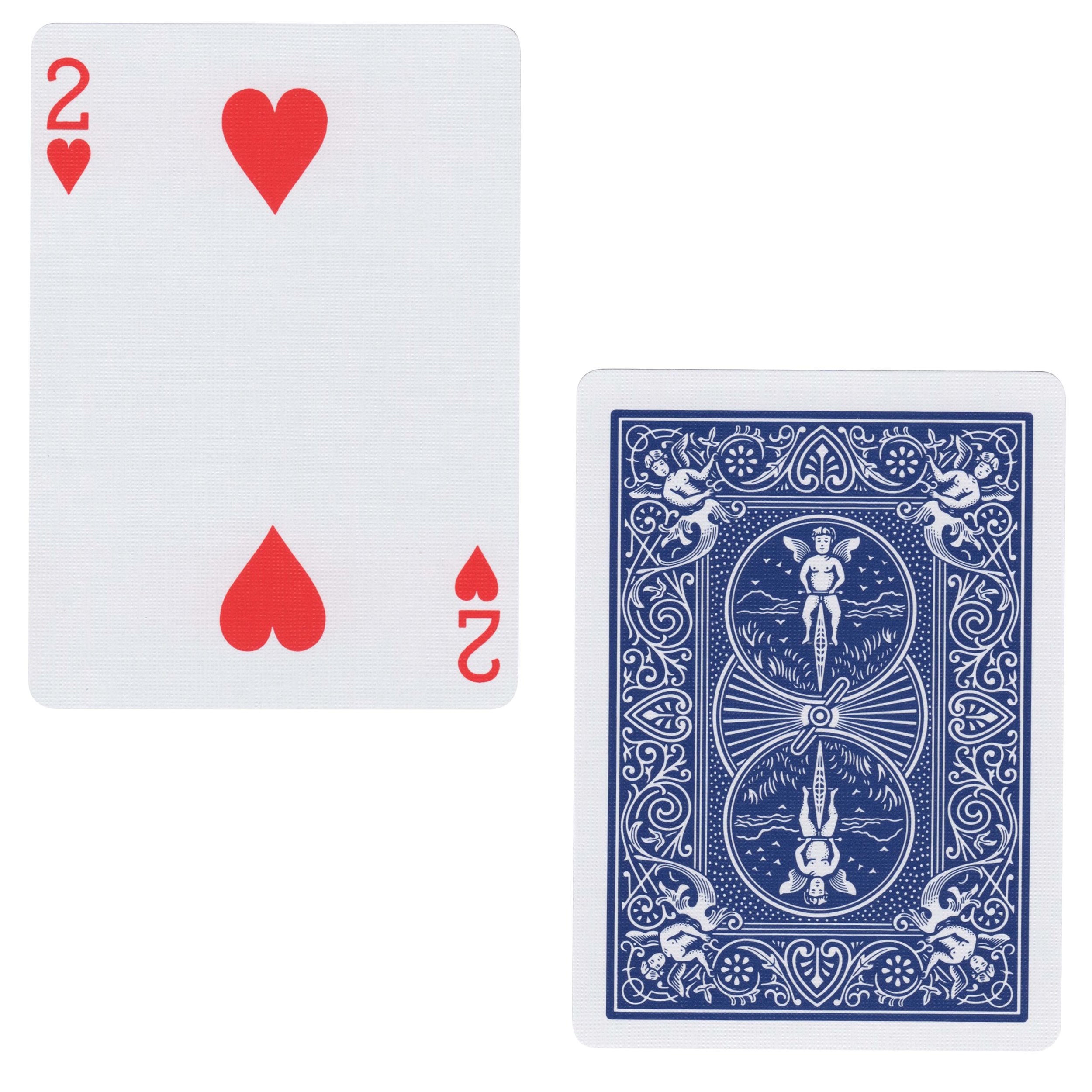
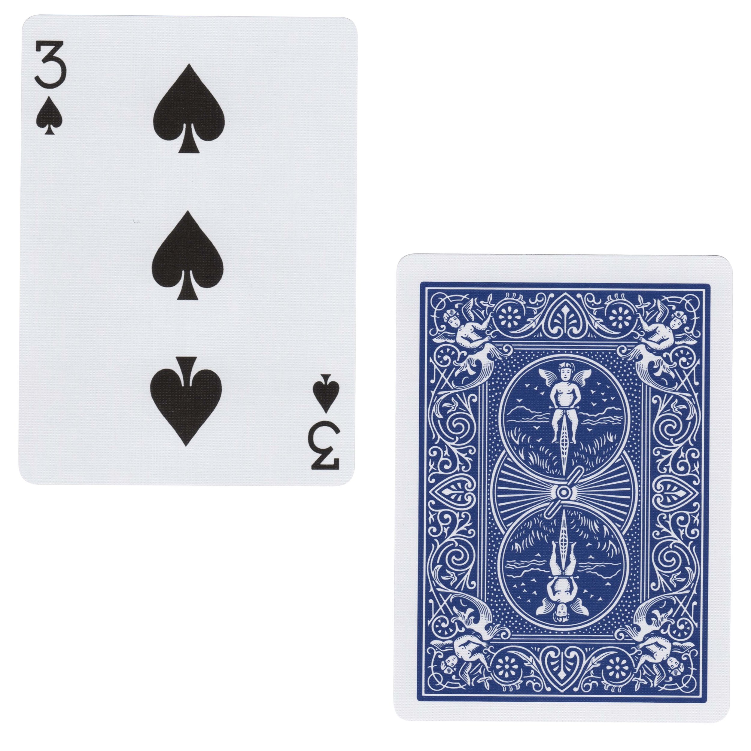
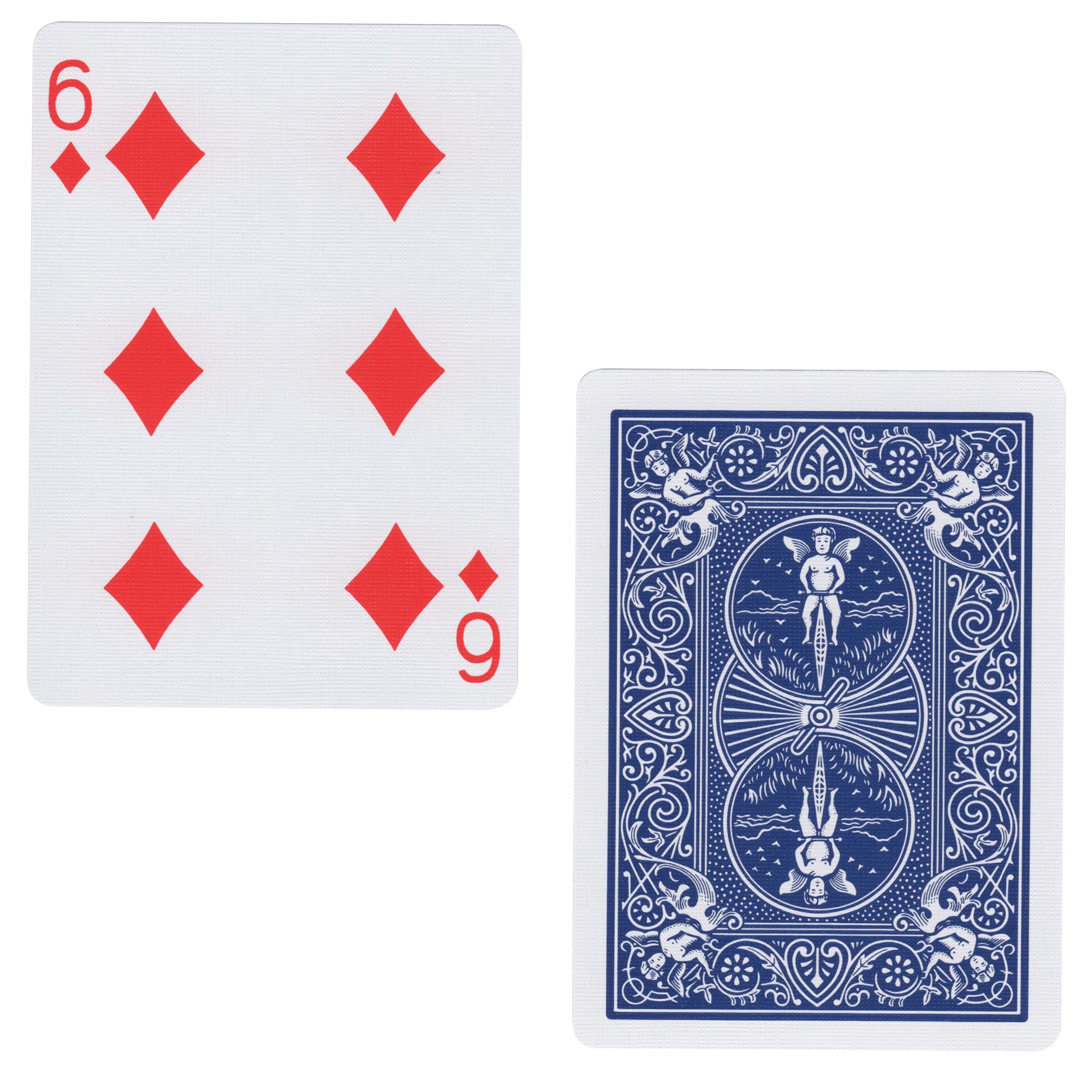
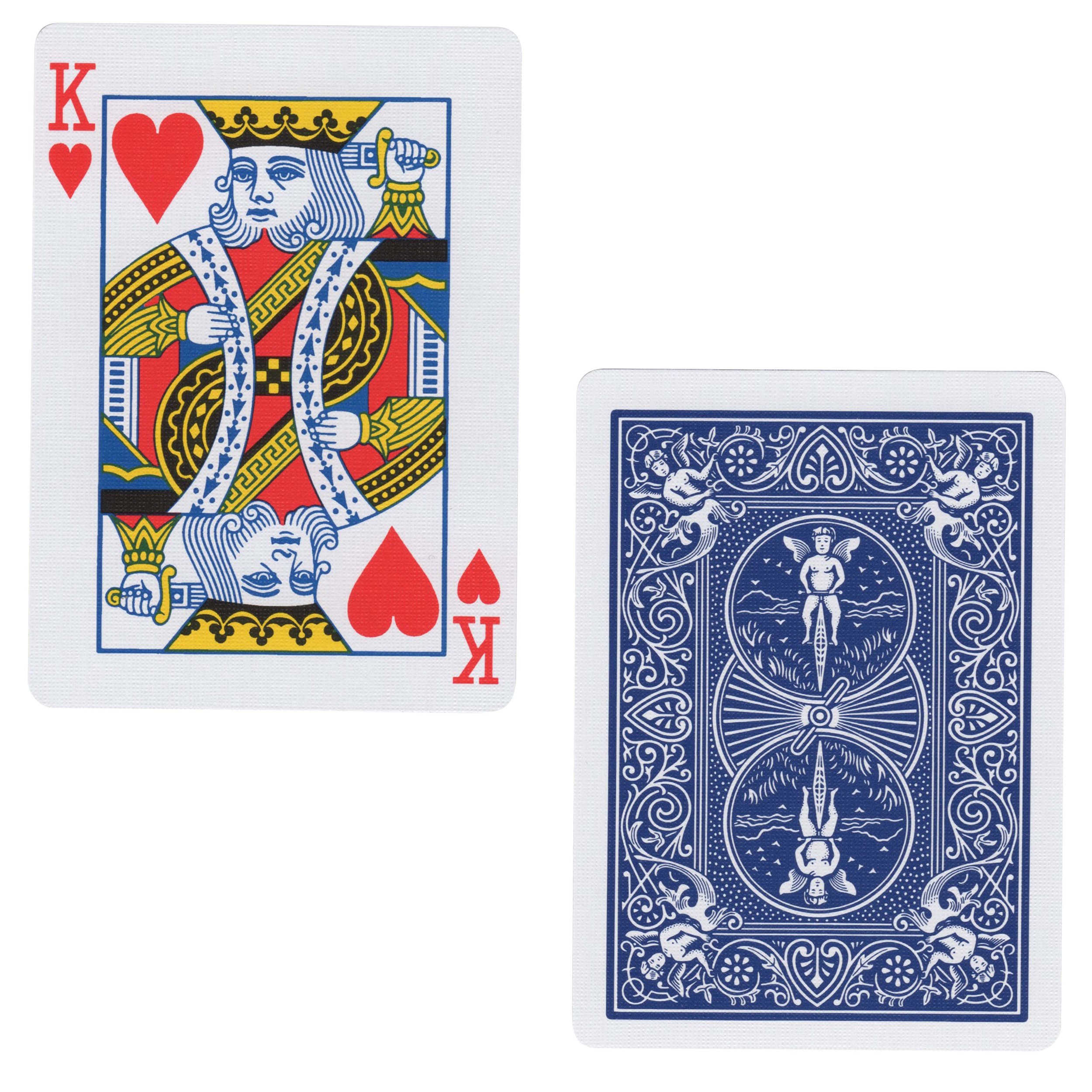
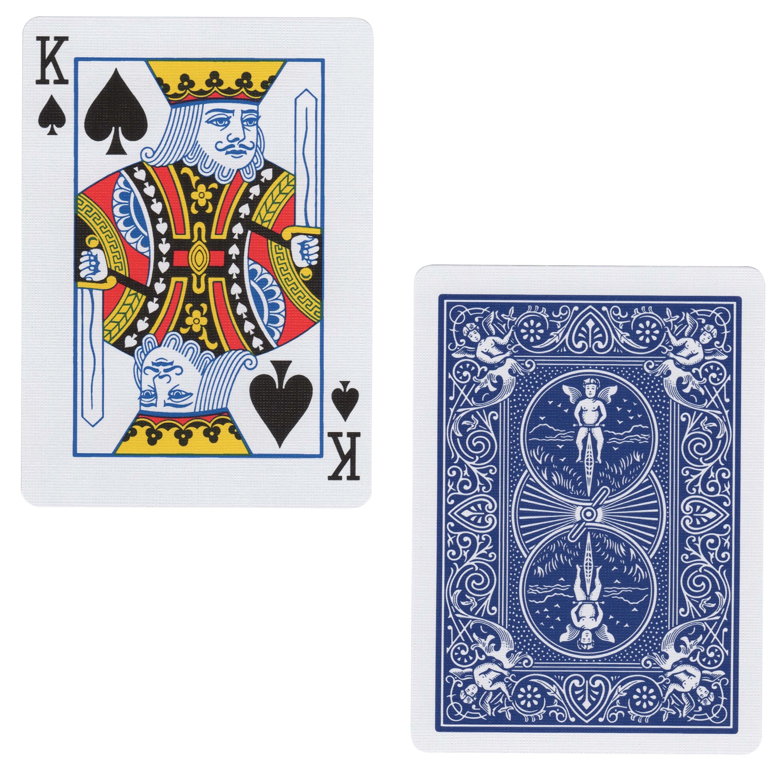
Once all of the planning was out of the way, it was time to jump back into Cinema 4D. I had several decks of cards on hand and went the practical effects route to create my card textures. I scanned them at a very high DPI for extreme close up shots so that the tangible features of the cards would be seen. The goal with these two shots was to mimic photorealism as much as possible. Once scanned I went into Photoshop to solo out the cards I wanted to use.
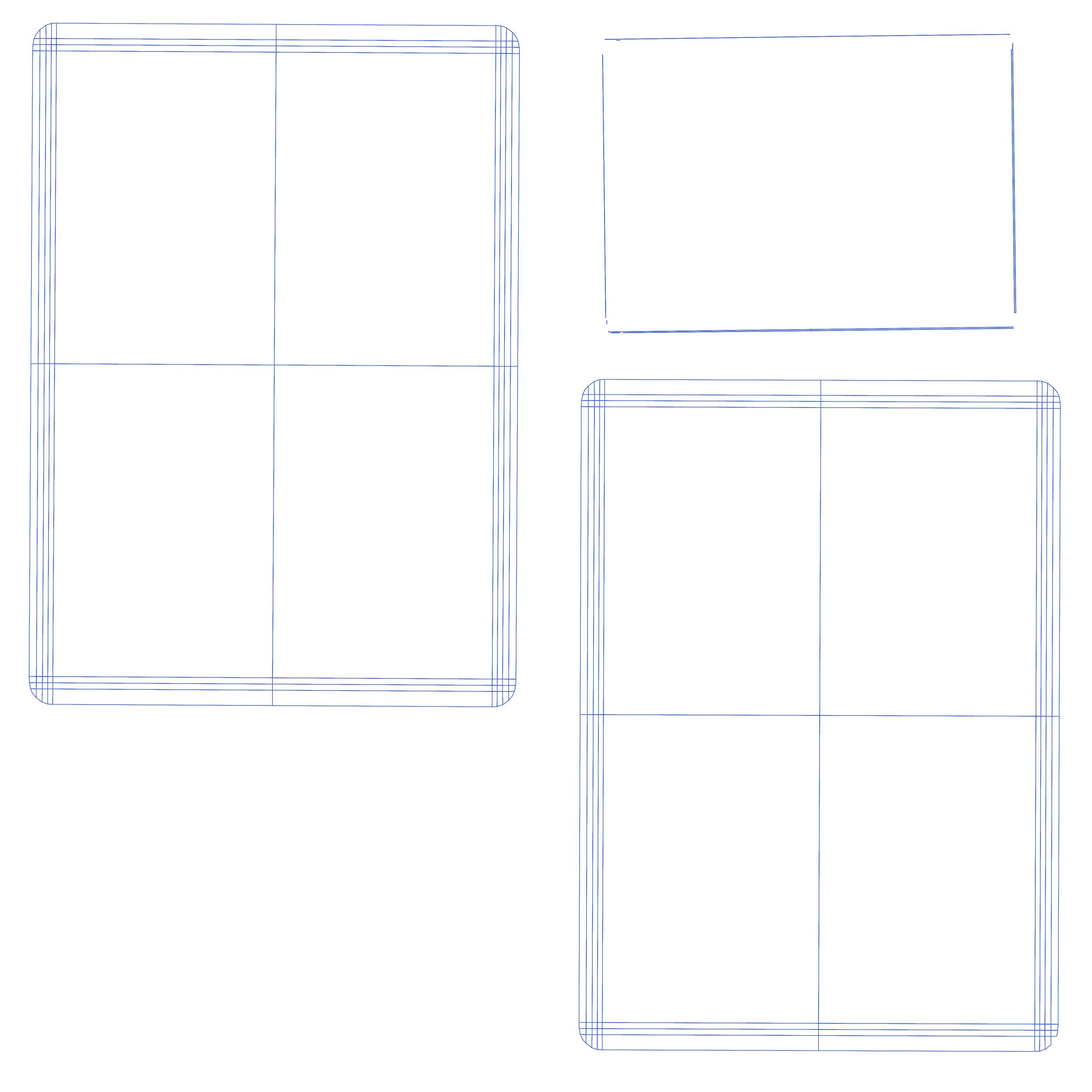
With asset management out of the way the next step was to model the first playing card. I thought creating a card would be the easiest thing to do, but because I wanted the cards to animate a certain way I was very, very wrong. In terms of the model itself I thought the card was going to be a subtly rounded rectangular plane. And in terms of the texturing I thought I was going to have two planes unwrapped, but when I factored in the physics and dynamics of the card animation (i.e., a bullet ripping through the card) things got tricky quickly. I started out with a simple plane and used some planar mapping to get my UV lines. What I didn't realize though was that the texture that was going to be on front of the card would also be duplicated and reversed on the back. This wasn't going to work with my animation idea so the plane got scrapped initially.
Next I tried making a very thin rectangular box so that I had one texture for the front of the card and a separate texture for the back, but I ran into a problem with this approach, as well. One thing to keep in mind when creating any 3D model is to know that the model won't be a solid mass like a sculpture would be in real life. There is no substance or geometry on the inside of a 3D model and instead represents more of a shell if you will. This was the problem I ran into when it came time to animating the bullet ripping through the card. How was I going to get this to work as realistically as possible? That is an answer I am still searching for and welcome any and all suggestions from visual effects community ;)
Ultimately the work around that produced the best results was good ol’ cinematic trickery, a.k.a. using a single plane for the base model, using less manipulation on the card so that you couldn't see the back of the card, and focusing the camera angle on the front of the card where the bullet was going the rip through it. I also had to cheat and use just the front face texture of the card, which I knew was going to be duplicated on the back. I upped the geometry on the card so that the shards would be realistic enough upon impact from the bullet, and played with the depth of field so that you didn't notice the same texture was on both the front and back of the card as the shards flew away from the camera. This involved both manipulation of the depth of field and playing around with the speed and acceleration of the bullet as it animated over time, which was a sweet spot of about 20 frames for the animation. In order for these types of simulations to work as accurately as possible, as well, the card and bullet also had to be about the same size that they would be in a real world simulation. The card and bullet couldn't be too small or too big or else the physics wouldn't work properly.
The bullet model didn't just make itself either. I had to model that element, too, but it was a lot easier given it was the object doing all of the work in this shot. It was a lot easier to model because I knew procedural texturing was going to be my best friend in this instance, as well. Easy peasy.
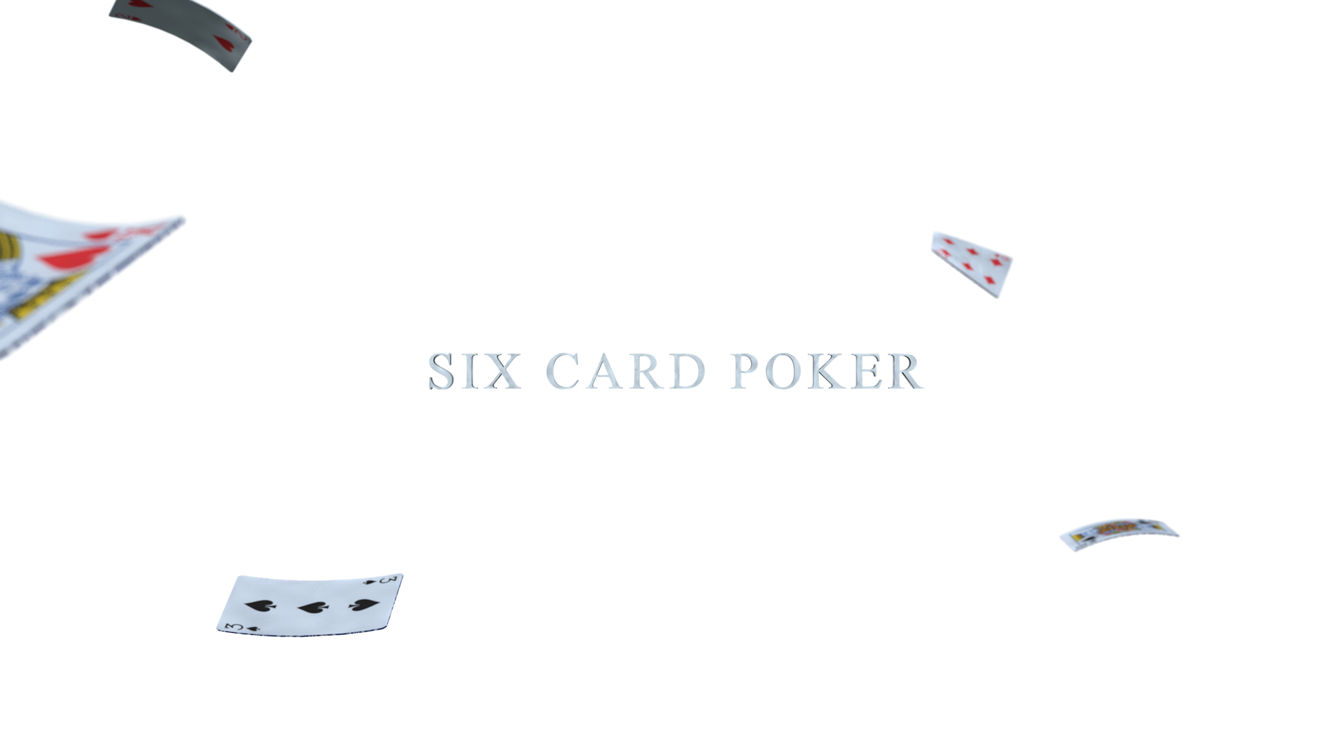
For the last shot of my storyboard, I simply mimicked how a space might look if a brawl broke out and cards ended up flying all over the place (some foreshadowing of how this poker game ends). This shot was a bit simpler than the previous one because it just meant twisting and bending the cards a bit, and positioning them throughout the scene. The cards this time around though weren't simple planes because of the before mentioned texturing problem that came up. Although still not ideal I opted for the shallow rectangular boxes for this frame, and boy was this a challenge. Unwrapping and texturing the boxes was no easy feat either. Texturing a box is pretty much 3D 101, but the teeny tiny quadrangles that made up the sides of the box made for the most complicated unwrapping... ever. I ran into some problems when it came time to make the card textures because of my horrific UV unwrapping job. As a quick hack though I offset the textures on the back of the cards to fill up as much of the backside as possible. It was a tad messy, but luckily I have Photoshop and After Effects to correct that. When it comes time to animate this frame I will have to problem solve a bit more and maybe even go back to the drawing board in terms of unwrapping the UVs altogether.
I also ended up changing the title font while working in Cinema 4D, as well. Back in Lesson 2, I thought Verlag was going to be my font of choice when it came time to further explore this title sequence, but once I got into Cinema and started pairing the title with the scene, Verlag just didn't feel right. The obvious choice was to choose a font that resembled that of the numbers and letters on the cards, something more serif in nature, but still had the same weight and feel. So instead of Verlag I decided to use Times New Roman. I had some other fonts I was considering including Adobe Caslon Pro and Didot, but they didn't match the character of the playing cards. Times New Roman, a font we are oh so familiar with, was the perfect balance this title needed.
I don't want to drag this post on any longer, but I would be doing a disservice to you if I didn't mention one of the most important aspects of a 3D scene, a.k.a, the lighting. I prematurely lit both scenes in Cinema 4D based off of Patrick Foley's skillshare tutorial, and learned a ton from this dude as a result. Lighting can either be straight forward or immensely complicated based on the 3D scene you're working with, but in the end, it's the lighting that actually establishes the mood in any show or film. If you've ever seen anything done by Pixar, you'll know what I mean because the lighters at Pixar have mastered this art.
As you can see from this extremely long post, this lesson was super involved, and I commend you for reading this far especially if you have no idea what I just said. If I had to sum this post up in one paragraph though the general take away from this lesson would be that experimentation is the best mentor. A lot of decisions were made, then rethought, then put into practice again, and then inevitably rethought. It was a true real world experience minus the time constraint of a deadline. I felt like a designer, producer, director and scientist all rolled into one, and honestly, it was pretty awesome. This exercise also made me appreciate my work team (#TeamAwesome) even more, as well, because more heads are always better than one, and teamwork makes the dream work. Sure, it should come as no surprise to a modern motion designer that you are expected to wear multiple hats throughout a project, but true team collaboration is so much more efficient and often times produces the best results over a one man band.
I hope you will join me in the next blog post as I start to composite these renders and bring this title sequence to life. Stay tuned!


