• Work
  • About
  • Reel
  • Media
  • Blog
  • Studio

CAROLINE A. LE

Animation + Motion Design Portfolio

  • Work
  • About
  • Reel
  • Media
  • Blog
  • Studio

Book Review: The ONE Thing by Gary Keller

Book-Cover_TheONEThing_V01.jpg

The ONE Thing by Gary Keller is considered one of the more popular self-help business books out there and it’s personally been in my reading queue for quite some time. Now having finished it I can confirm the hype. It really is a great book, and a quick and digestible read all about the simple approach to achieving one’s goals.

From start to finish Keller demystifies the concept of extreme success by having the reader ask themselves one question, the Focusing Question:

“What’s the ONE Thing I can do such that by doing it everything else will be easier or unnecessary?”
— Gary Keller; The ONE Thing

That’s it. It’s a simple but loaded question. It forces the reader to define their dreams (what am I most passionate about? what am I most skilled at? what’s my big goal?) but it also pulls the reader into the present moment so that they can clearly define what is necessary right now to chase that dream (what can I do right now to fuel my passion? to get to the next level? to achieve my dreams?). The Focusing Question is what Keller likes to call a “big-picture map and a small-focus compass.”

Defining your big-picture ONE Thing is the first step to achieving your greatest potential, but it’s your priorities that make it actionable. Keller describes this concept as “Goal Setting to the Now.” It’s how a someday goal can turn into a five year goal, which can turn into a one year goal, then a monthly goal, then a weekly goal, then a daily goal and ultimately a right now goal. As Keller says, “it’s a formula built on knowing what matters to you and taking daily doses of actions in alignment with it.”

The book dives into Goal Setting to the Now in greater detail by discussing tools like time blocking, accountability management, personal energy management, community support and many others. There were a lot of great tools and tips discussed, but some of my favorite takeaways were around the concept of time blocking. I’ve always known how important it is to have balance with work and leisure, but time blocking really allowed me to rethink how I’m managing my time in both areas. Most importantly it allowed me to rethink my time spent as a creative.

Creatives are notorious for spending hours on their craft, even in their free time, because they’re so passionate about the work that they do. I know this all too well because I’m guilty of it myself. Creatives tend to forget how important it is to step away from their work because the mind, just like any other muscle, needs adequate rest. And it’s one thing to step away from the computer and stop doing the physical work, but it’s another to completely shut off the mind when ideas are constantly flooding it. Creative energy can be easily depleted so it’s important to nourish it. Challenge the mind, but let it rest. Feed the mind, but don’t overwhelm it. Above all, always be on the lookout to counterbalance its present energy.

If I learned anything from The ONE Thing it’s the art of counterbalancing and how to measure productivity. If you are looking to add a little more structure to your professional and personal life, especially if you are a creative who feels like you’re spinning your wheels with no end in sight, then this book is for you. It will single-handedly change your perception of productivity in the best way possible, and with Gary’s relatable writing style, I can guarantee you won’t be able to put it down.

“At any moment in time there can be only ONE Thing, and when that ONE Thing is in line with your purpose and sits atop your priorities, it will be the most productive thing you can do to launch you toward the best you can be”
— Gary Keller
Wednesday 11.11.20
Posted by Caroline Le
 

Book Review: Contagious by Jonah Berger

Website_Book-Cover_Contagious_09152020_V01.jpg

If you have a curious mind like me you ask yourself questions like, how does this thing work? How come this idea/concept is the way it is? Or how come the current state of affairs are the way they are? And in this era of information overload another question I often ask myself is, why do certain ideas get a ton of attention and others don’t? What makes them so special? Luckily, I’m not the only one to have asked these questions. Apparently enough people have asked similar questions to the point where Jonah Berger felt it necessary to address them in his book Contagious: Why Things Catch On.

Contagious: Why Things Catch On is all about the potential virality of pretty much anything. Believe it or not ideas, products, trends and content of all shapes and sizes have the potential to go viral, but as we’ve seen in our daily lives, not everything does. Why? According to Jonah, contagiousness is determined by six key principles: social currency, triggers, emotion, publicity, practical value and stories. All six principles don’t have to be met in order for something to be contagious, but at least one of them will be present if you go back and analyze some viral moments from years past. I won’t go into detail about the principles (you can enjoy the discovery of each of them if you decide to purchase a copy of the book), but all six key STEPPS are vital to contagiousness.

Much like other marketing books, the key takeaways in Contagious are all about human connectedness, emotion and survival. It is innate that humans share. Sharing information is vital to our well being, and as Jonah says, “when we share, we care.” When linked to survival, the concept of sharing information can seem selfish and self-promoting, but it is in fact about providing value to and looking out for our tribe. We feel a sense of connection and build relationships by doing so. We fulfill several needs by sharing information including the need to belong, a sense of security and a desire for status. So the next time someone sends you a video of a cat playing piano on Youtube, thank them. Their act of sharing resonates on a much deeper level than you may think ;)

It’s no surprise that contagiousness (and virality) is intricately linked to the human psyche. When we start to understand what influences us, societal extensions of the human experience, including marketing and advertising, make much more sense. Contagious: Why Things Catch On is a must for anyone who is dedicated to studying the delicate interplay of human psychology and marketing in our modern world, and if you have a growing list of marketing books I suggest adding this one.

“Talking and sharing are some of our most fundamental behaviors. They connect us, shape us and make us human.”
— Jonah Berger
Monday 10.12.20
Posted by Caroline Le
 

Book Review: Delivering Happiness by Tony Hsieh

Website_Book-Cover_Delivering-Happiness_V02.jpg

I’ve really enjoyed the conversations I’ve been having with everyone on Instagram about the books that I’ve read or am currently reading, and thought it might be cool to have a space here for personal reviews of some of my favorites. So today starts a series of book reviews that begins with Delivering Happiness by Tony Hsieh.

I get my reading recommendations from several sources, but more often than not they come from Mr. Chris Do and the wonderful people of The Futur. Their reading lists never disappoint and Delivering Happiness was no exception. I still have plenty to read before the end of the year, but I’m not going to lie, this book is a contender for 2020 Favorite Book of the Year. Trust me, it’s that good.

Delivering Happiness in a nutshell is all about discovering the answer to “What am I working towards?” and more simply “What makes me happy?” These were questions the author, Tony Hsieh, asked himself throughout his career, especially when building the Zappos empire, and questions that drove him to ultimately “stop chasing money” and “start chasing [his] passion.”

As the book chronicles the Zappos journey, from its early days in the Bay Area to the HQ relocation in Las Vegas and the company’s ultimate mission about cultivating the best customer service, it discusses the subconscious dialogue we all deal with daily (and without evening knowing it), and putting it front and center for questioning. As Tony says, if you ask yourself ‘why?’ enough times (whether it be about your personal or professional aspirations), you arrive at the same conclusion as everyone else; that whatever it is that you are doing or looking to achieve will ultimately make you happier. Asking ‘why?’ was Tony’s North Star and the successes he achieved by following it speak for themselves. Throughout the book he encourages the reader to think about their ideals and question how passion, relationships, inspirations, goals, core values and a sense of purpose contribute to their desire for happiness.

Tony’s heartfelt and genuine story was more than impactful. It was one of the most inspirational stories I’ve ever read, and one that will always be top of mind. Entrepreneur or not, I hope everyone who picks up a copy of Delivering Happiness enjoys his fresh perspective on business and life as much as I did.

“If you keep asking yourself ‘why?’ enough times, you’ll find yourself arriving at the same answer that most people do when they repeatedly ask themselves why they are doing what they are doing: They believe that whatever they are pursuing in life will ultimately make them happier.”
— Tony Hsieh
Monday 09.21.20
Posted by Caroline Le
Comments: 2
 

The Futur: Styleframes

Update as of 7/21/2021: This page uses affiliate links which means that if you decide to make a purchase through one of these links I will get a small commission at no additional cost to you. Rest assured that I would recommend these products regardless of their commission-based opportunities.

TF_S&F_BlogPost-TitleCard_FINAL_V01.jpg

Much like everyone else I’ve had some new down time on my hands and what better way to make use of it than with another continuing education course? When The Futur’s styleframe course first became available a little over two years ago I jumped at the opportunity because if I’ve learned anything in my short career thus far it’s 1) storytelling is a constant work in progress and 2) that I really enjoy creating styleframes, so when I saw that Matthew Encina was going to be the instructor for this course I knew I was going to learn a lot about both subjects from him. Matt’s approach to design and storytelling is very thoughtful and methodical, two qualities that I value very much in my own work, and as a result he was an invaluable teacher. Below I give a rundown of some of the work I created for each of the assignments from Styleframes (previously titled Story & Frames).

TF_S&F_StoryComp-TitleCard_Final_V02.jpg
TF_S&F_ZombieApocalypse_032119_02.jpg

The first lesson in Styleframes was all about design fundamentals. Everything from hierarchy, value, context, framing and more was discussed in great detail. I often forget that things that look really good, look good for a reason… because they follow these (and several other) principles. It’s refreshing when I’m reminded of these principles because it allows me to be mindful of my compositions from both technical and communicative points of view.

The goal for our first assignment, and for the duration of the course, was to use the skills and principles discussed in this lesson (and throughout the course) to build a frame that conveys a unique perspective of a zombie apocalypse. I’m not one for zombie apocalypses generally (my husband to this day still doesn’t understand how I’m not on the Walking Dead bandwagon), but I decided to make the frame fit my personal style and different from your typical zombie motif. More on that below.

TF_S&F_MoodBoards-TitleCard_Final_V01.jpg
TF_S&F_Product Moodboard_v01.jpg
TF_S&F_Title Sequence Moodboard_v01.jpg
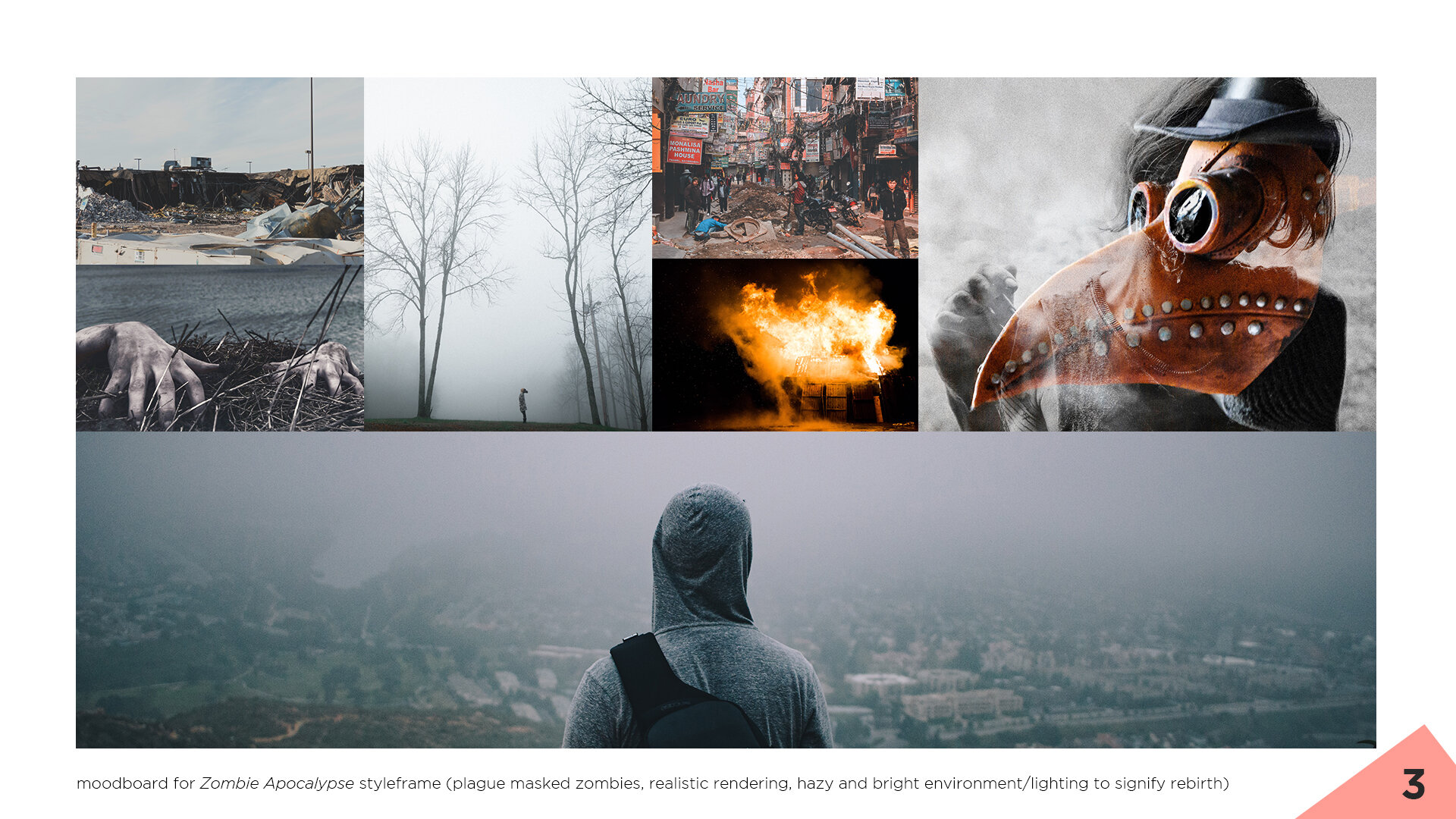
TF_S&F_Zombie Apocalypse Moodboard_v01.jpg

I’m a big fan of moodboards and have always been a proponent of creating one with my clients no matter a project’s scale. They provide a lot of clarity and direction before committing to a style, and are further backed up by styleframes and storyboards before fully executing on any design or animation. You can probably tell why Matt’s methodical approach resonated with me so much now ;) In order for my zombie frame to be strong I knew I needed to create a moodboard that communicated the mood and aesthetic I was hoping to achieve. Additionally, the images I selected would also need to match the language I was going to use to describe my narrative, too.

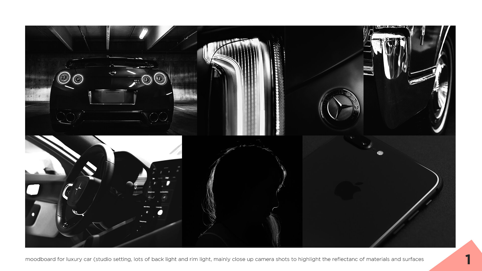
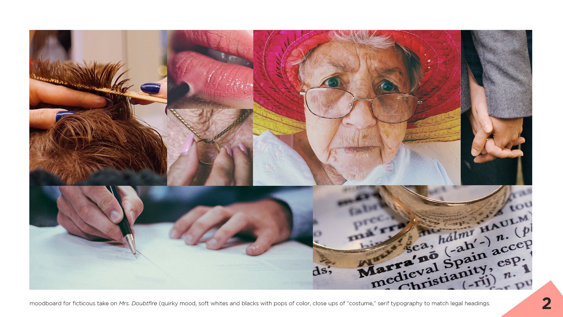
For this assignment Matt tasked us with creating three moodboards for three different prompts. The first prompt was to create a moodboard for a high-end product of our choosing. The second was to create a moodboard for a fictitious title sequence of an existing movie. And the third was to create a mood board for our zombie apocalypse styleframes. For the first prompt I created a moodboard for a luxury car company and specifically chose to focus on the camera angles and materials to set the tone for the speculative piece. For the second moodboard I chose to create a fictitious title sequence for Mrs. Doubtfire, my favorite movie of all time, and decided to focus on soft color palettes, close ups of an older woman and objects of love to set a familiar and gentle tone. For the third moodboard I decided to put a lot of my focus on the lighting and environmental textures in order to create a styleframe that signified rebirth and aftermath. You can find each moodboard in the carousel above with various imagery and descriptions to provide further context.

TF_S&F_Assets-TitleCard_041520_V01.jpg

What I’ve thought of as a pretty mundane task was actually one of the most valuable lessons in the entire course. Matt’s approach to gathering assets was really eye opening. He showed us how to break down our image searches in a multitude of ways, and harnessed the power of language to find imagery that conveyed intent and feeling. My approach to asset gathering has forever changed because of this assignment and it has become an unexpected game changer for brainstorming and my overall work.

I don’t have much to show for this assignment and figured it would be silly to post screenshots of my asset folder and subfolders, but it was a lesson that was very worthwhile nonetheless.

TF_S&F_PaintComposite-TitleCard_041520_01.jpg
TF_S&F_ZombieApocalypse_Final_V02-16bit.jpg

Lesson four was all about compositing, which is easily my favorite part of any project. Matt walked us through his whole process on building a styleframe and it was really cool to watch him in action. He’s incredibly thorough and creates reference boards for every aspect of his frames (i.e., lighting, textures, framing, etc.). He’s also very mindful of where the objects are in his frame and paints/composites those elements accordingly. I’m convinced that he has camera lenses for eyes because his compositing skills are top notch, and I hope to develop this technical prowess one day. That said, I made sure to follow his lead and gave my frame just as much care and attention to detail as possible.

My goal for the above frame was to capture life after the zombie apocalypse. I went with a lighter composition to visualize rebirth because, in my mind, I imagined the height of the apocalypse being dark both literally (i.e., buildings burning, dark pools of blood, thick black clouds of smoke) and figuratively (i.e., a lost sense of hope with no end in site). I also used hazy textures to communicate how vast the zombie damage was, how nothing was left untouched, and that the effects of the apocalypse were still being felt (i.e., buildings continuing to burn but not as prominent, some zombies still holding on for dear life, etc.). My protagonist, even with his back to us, is supposed to be a sign of hope and a symbol of forward movement. He acts as a compass and that, even with all the damage that has been done, there is a path towards rebuilding. I hope that message is visibly understood within this frame.

The last lesson in the course was all about the construction of pitch decks and their role in client meetings. As in previous lessons Matt described how important it is to be descriptive when delivering pitches, or any client work for that matter, so that the language matches the tone of the images being presented. Most importantly though he emphasized how important it is to use this time to show our clients what goes into our thought processes, and how beneficial it is for our clients to be a part of that process. By listening, gaining perspective and interpreting subjective feedback we all have the potential to facilitate successful client partnerships and ultimately successful projects. Even though there wasn’t an assignment to turn our zombie frames into a pitch deck I may take it on as another personal project of mine.

For more information on The Futur’s Styleframe course go to the following link, https://thefutur.com/course/styleframes, and should you decide to enroll I hope it provides you as much value you as it has provided me.

Thanks for reading along. Stay safe and be well.


PS—If you enjoyed this post about The Futur’s styleframe course, and want to learn more about the styleframe process from Matthew himself, and other industry professionals, check out the Styleframe Saturdays podcast on YouTube, Spotify or Apple Podcasts.

Friday 05.01.20
Posted by Caroline Le
 

Main Title Design: Brains Over Brawn

It has been close to two years in the making, but today I can finally say that I’ve completed Ash Thorp’s Main Title Design course! I wish it hadn’t taken this long, but I’m proud of myself for always coming back to the lessons despite a busy schedule.

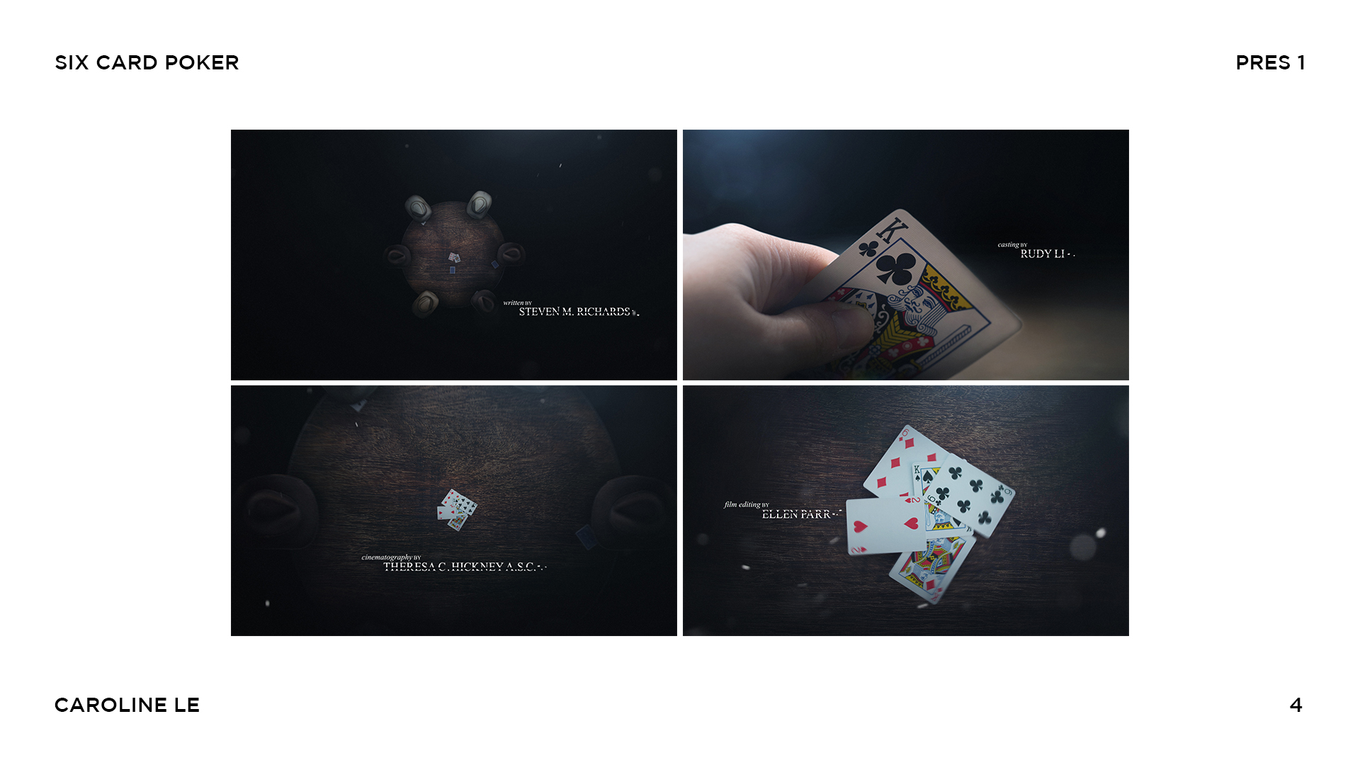
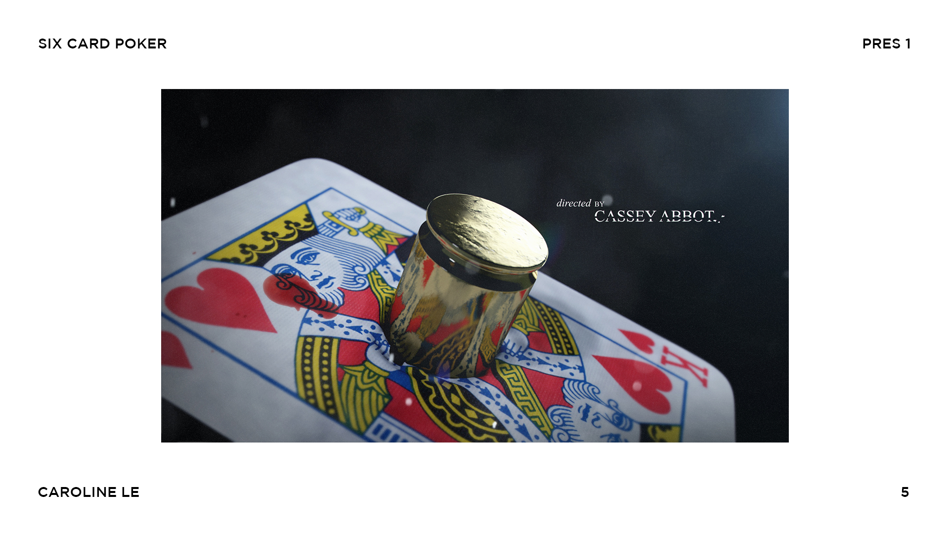
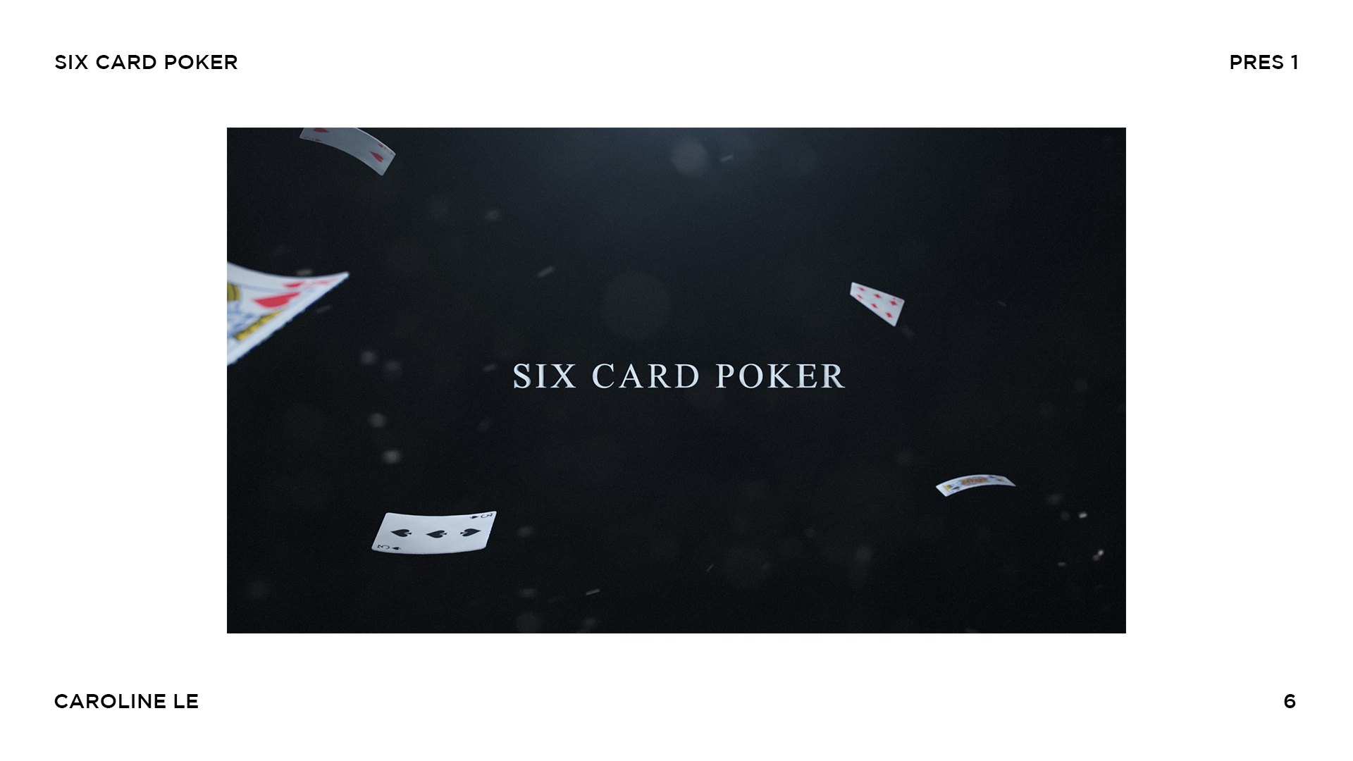
The last lesson of the course was focused on building a presentation for a client with the final homework assignment being a presentation. The presentation was supposed to include all of the work created throughout the course and curated into a single website mockup. Luckily for me I’ve been documenting my journey the whole time so I already had part of the assignment done, but I knew I wanted to do more than just reference my blog posts though so I decided to create a presentation for Six Card Poker as well as an animated title sequence.

For the presentation I wanted to focus on the best slides while keeping it short, sweet and to the point. Since I only created six slides in the last homework assignment I ended up including all of them in the presentation, but made sure to highlight the last two frames in particular since they are, what I believe to be, the hero frames. By highlighting the details in both of these frames I felt I was showing a potential client the level of detail my team and I are able to create while executing a project. [click the images below to see full presentation]

LS_BoB-Title_v01.jpg
LS_BoB-Slide2_v01.jpg
LS_BoB-Slide3_v01.jpg
LS_BoB-Slide4_v01.jpg
LS_BoB-Slide5_v01.jpg
LS_BoB-Slide6_v01.jpg
LS_BoB-Slide7_v01.jpg

Putting the presentation together was a piece of cake compared to animating the title sequence. It was more of a challenge than I thought it would be to transition from styleframe to video.

First off, animating the photoshop files was more tricky than I imagined. Scenes built from the photoshop files felt very flat at first so I had to introduce some more motion blur to give those scenes extra dimension, depth and realness. Working with video footage was the second biggest challenge. Unfortunately my D7200 doesn’t shoot RAW footage so I knew I was going to have to manipulate a slightly compressed HD file. I didn’t have the resources to fake a darkened poker room either so I knew there was going to be some rotoscoping involved when it came to bringing the footage into After Effects, as well. Rotoscoping along with some color correcting and compositing eventually made the shot feel like it (somewhat) belonged in the sequence. It could be better improved, but given the resources I had at the time, it didn’t come out half bad.

I knew I was going to need some music to bring this title sequence over the top, too, and I feel the track I chose fits perfectly with the mood and tone of the piece. Again, there are parts of the sequence that could be improved, but for now I think it tells the story well and it shows off what I’ve learned over the past two years. Maybe someday I’ll take the time to rerender some shots and rent better equipment for a mini production shoot, but until then I feel my job here is done :)

Overall, I’m really happy with everything I’ve created while taking this course. I’ve learned SO much from Ash and his production workflow, and I’ve enjoyed learning how he masters his craft. I am planning to take the new skills I’ve learned from Main Title Design and applying them to many projects going forward.

Feel free to check out the Learnsquared page of my website where I’ve put together some of my favorite pieces from this course and referenced every blog post from the journey.

Thank you for following along the past couple of years! I hope you enjoyed my journey as a student again.

Six Card Poker by Caroline Le

Music: The Portal by Origami Pigeon

Licensed by: PremiumBeat.com

Monday 03.25.19
Posted by Caroline Le
 
Newer / Older